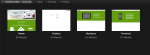
My realisation of concept consists of a multilingual website that hosts a short, introductory video and a set of both iPhone and iPad designs for the project’s products. I chose to focus on 4 pathways of design because of the depth of research and information I produced during the R&D stage.
I was relatively new to Adobe Muse and it took a while to overcome its hardships. Working with fluid/fixed width and break points proved to be difficult because of the versatility of moveable objects. I found on different screen sizes using fluid width objects would move out of place. Eventually I settled with a fixed width and this proved to be the most effective way of producing a good layout for the website. I am pleased with the outcome of the website as the colours and layout complimented each other.
The development of the short video was very much so a last minute decision. The header of the website looked plain without the video. Therefore I created a short message about GRND8 and what it can do for customers. The video is very basic in its appearance and I feel that I could have paid more attention to the production aesthetics. However, the video is strong in getting its message across and explaining to consumers exactly what GRND8 is about.
Originally I had wanted to just convert the website to the Chinese language. However, Vimeo had a plugin that allowed me to write my own subtitles. So I took the time sequences and translated my speech from the video. This suits both the branding and target audience engagement because they are able to follow the video as well. A large part of this project was target audience engagement. A chose an audience that would not easily be accessible in my position. However, it proved effective.
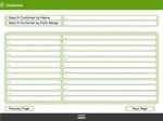
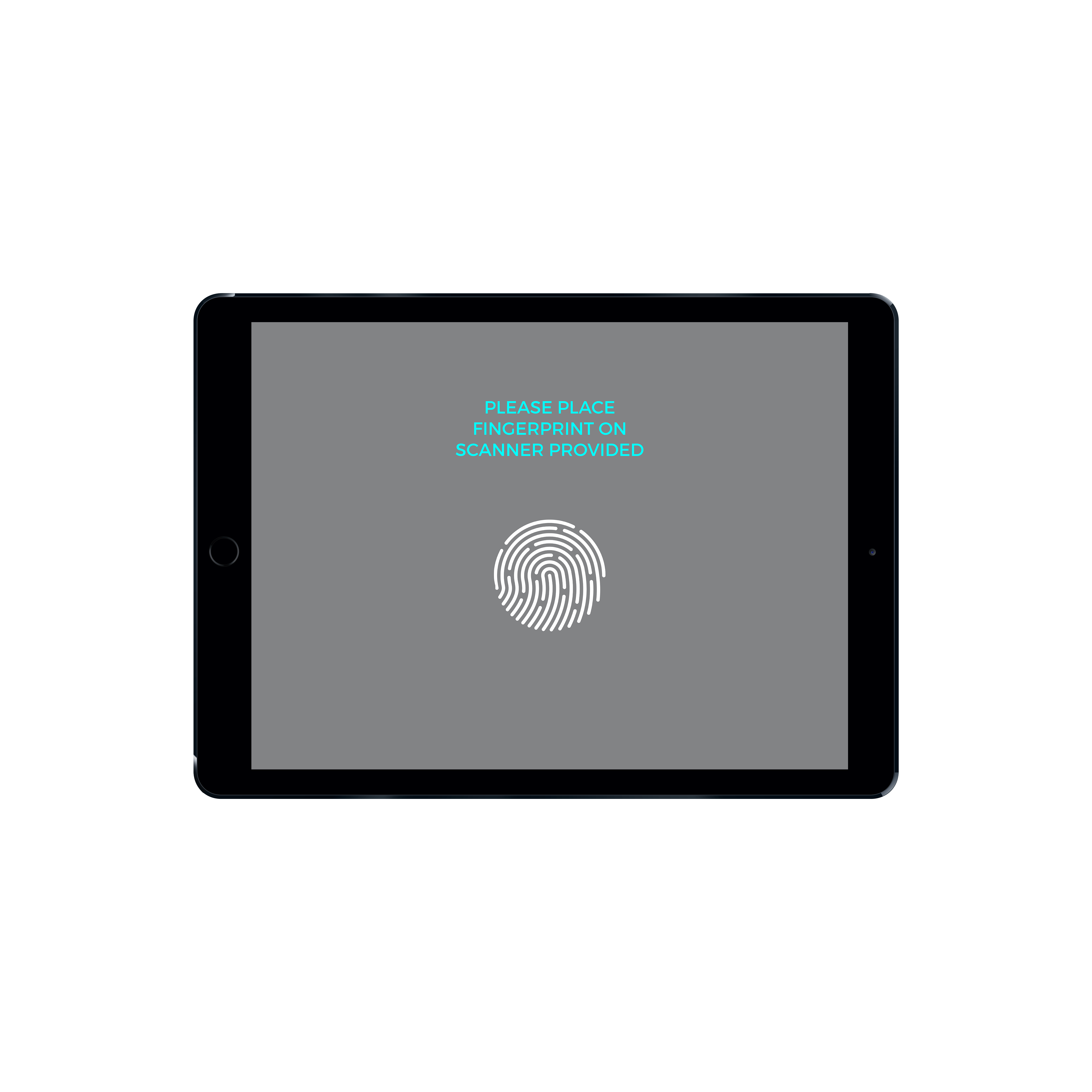
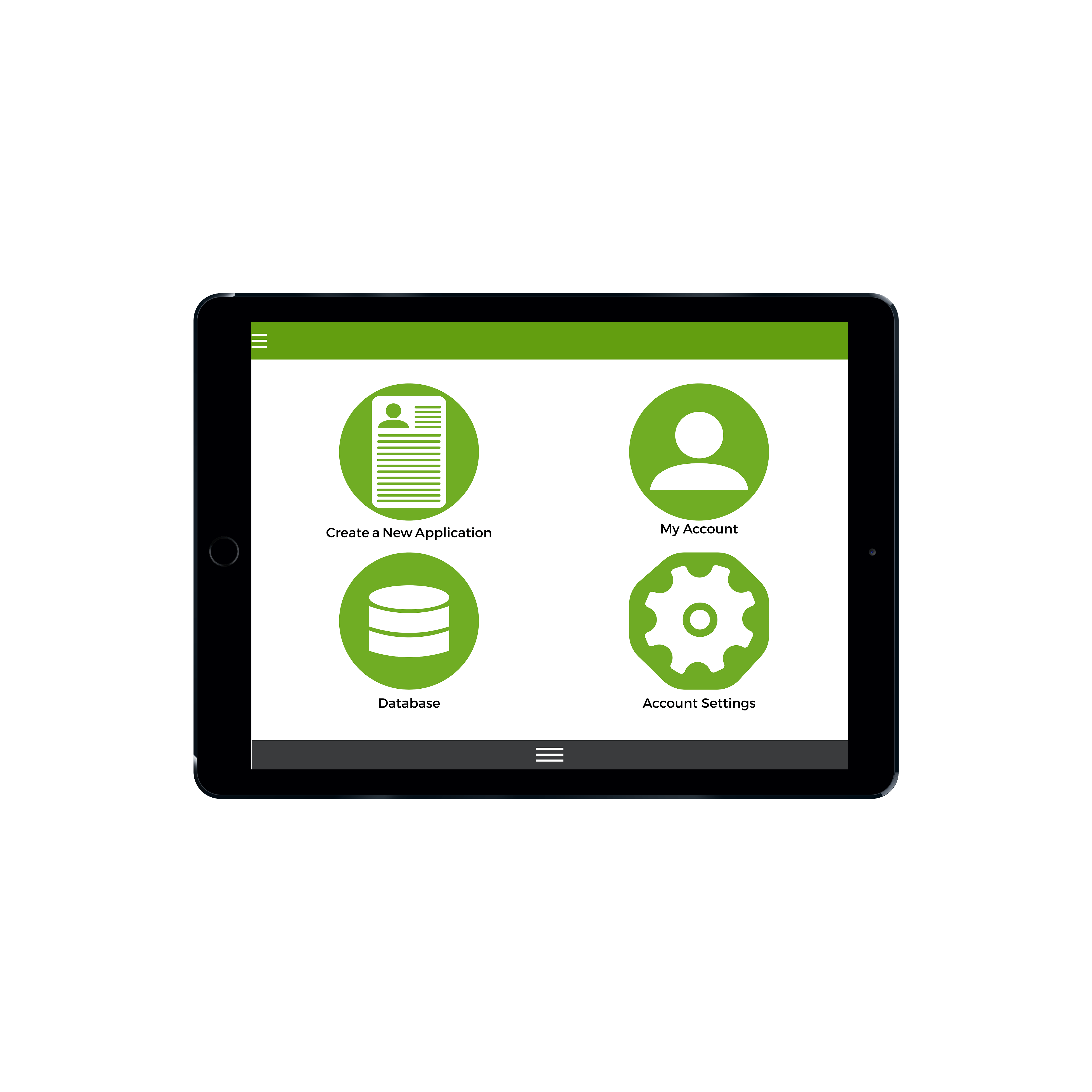
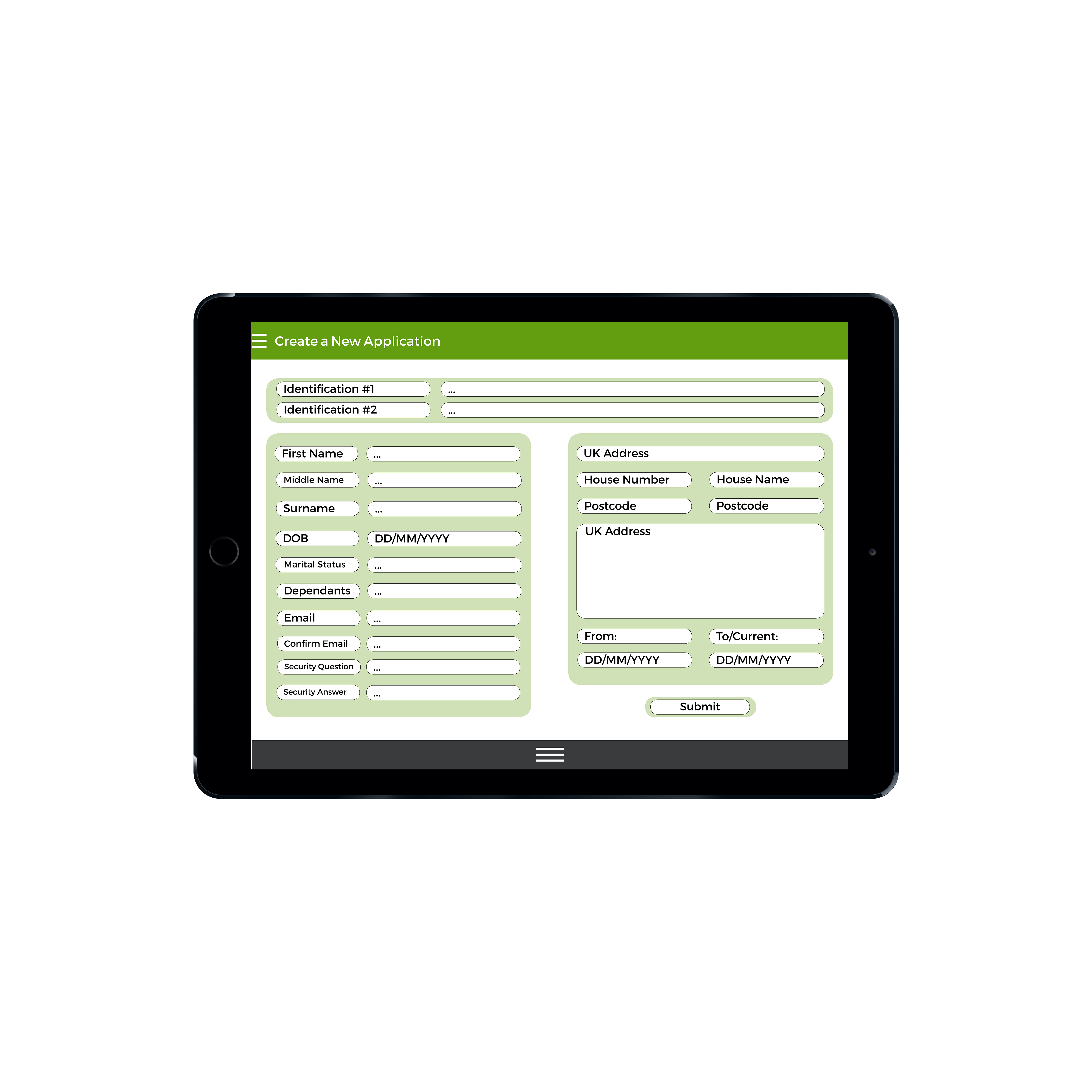
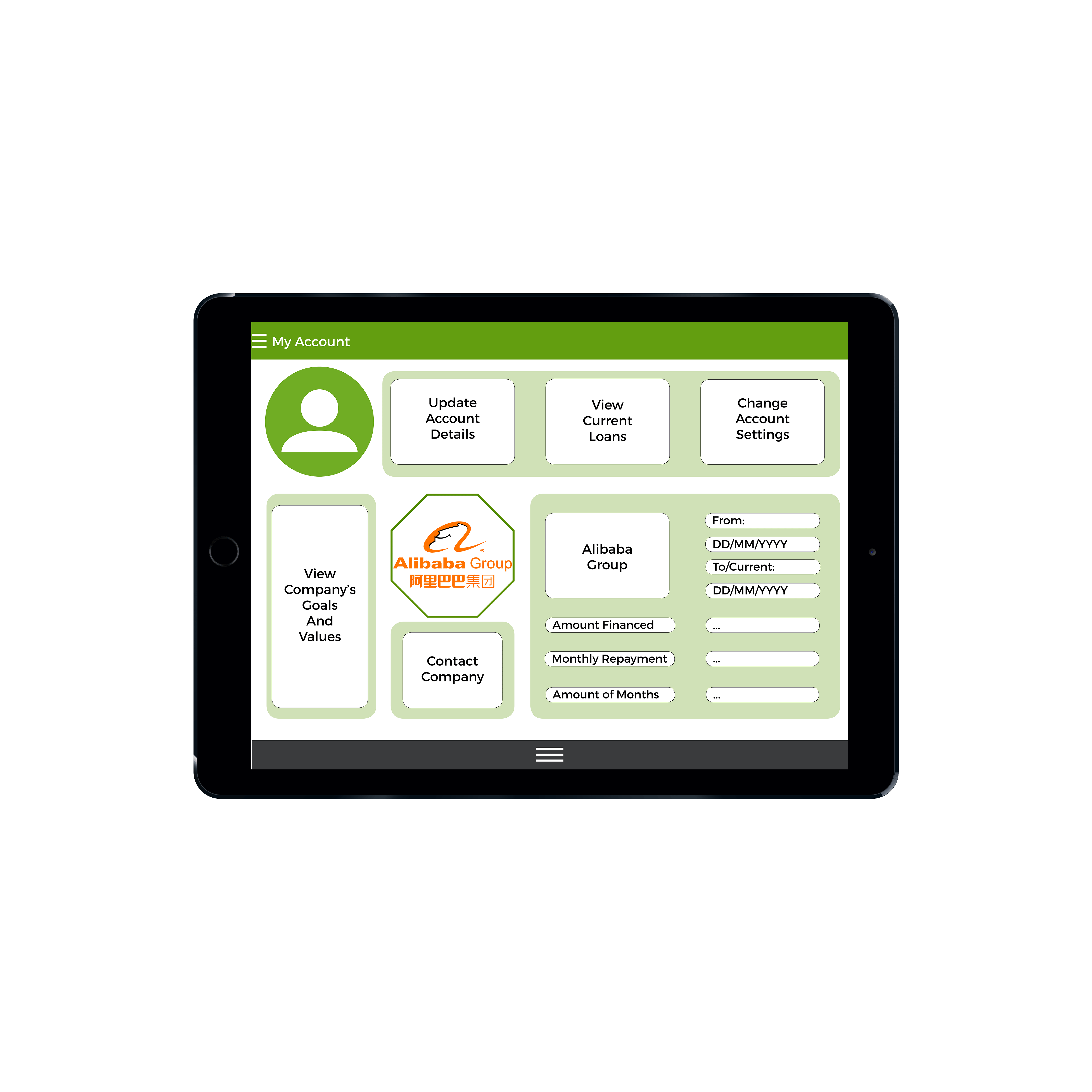
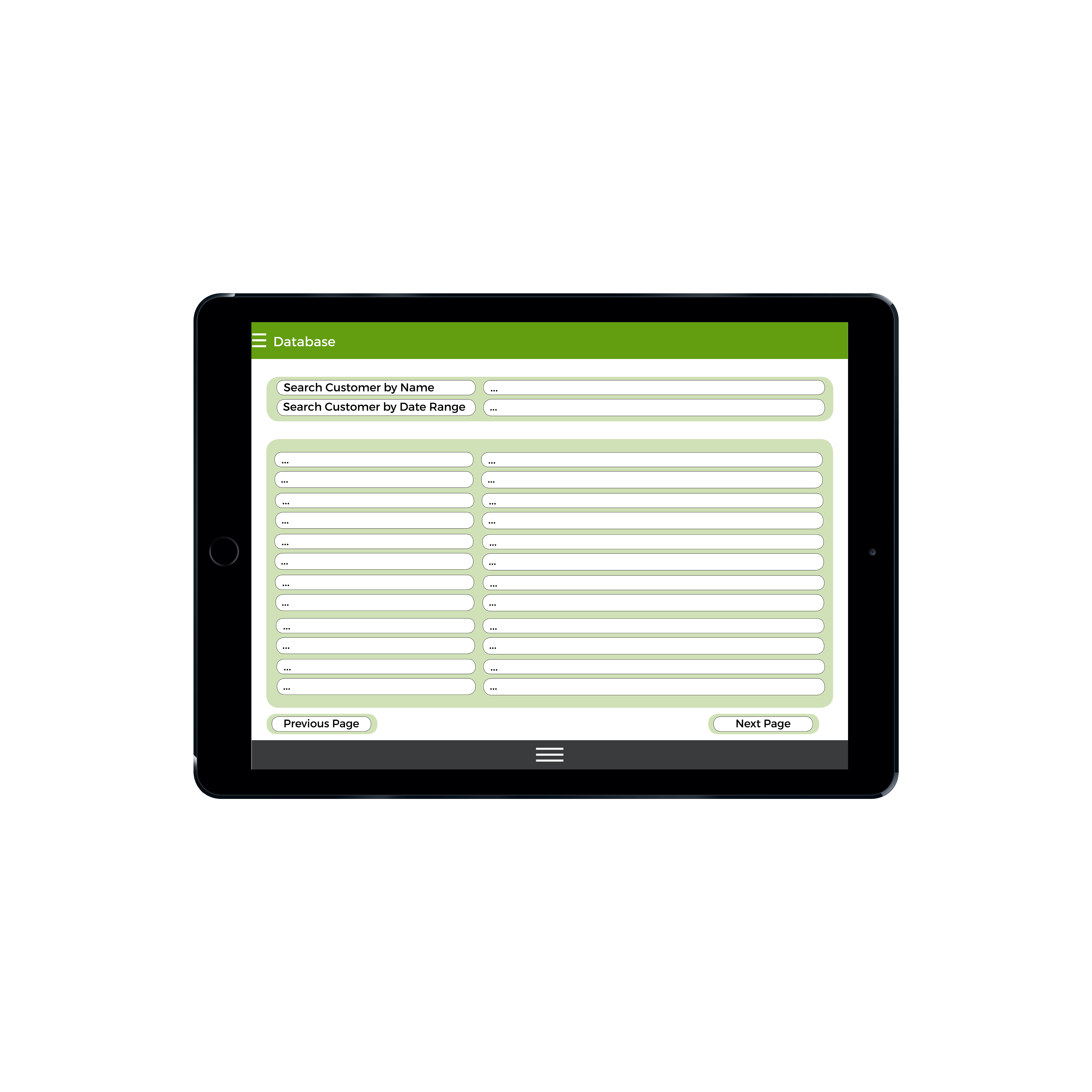
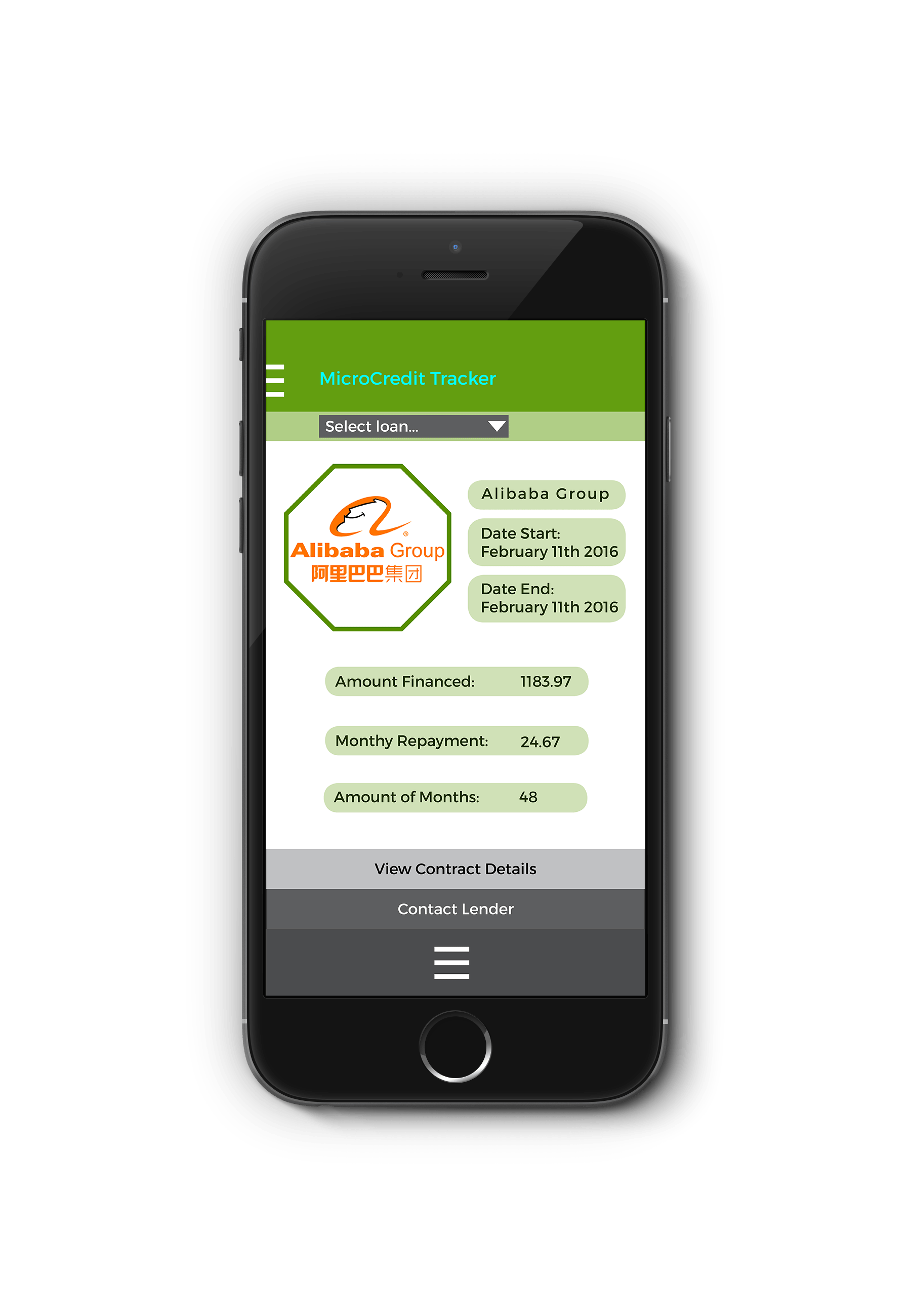
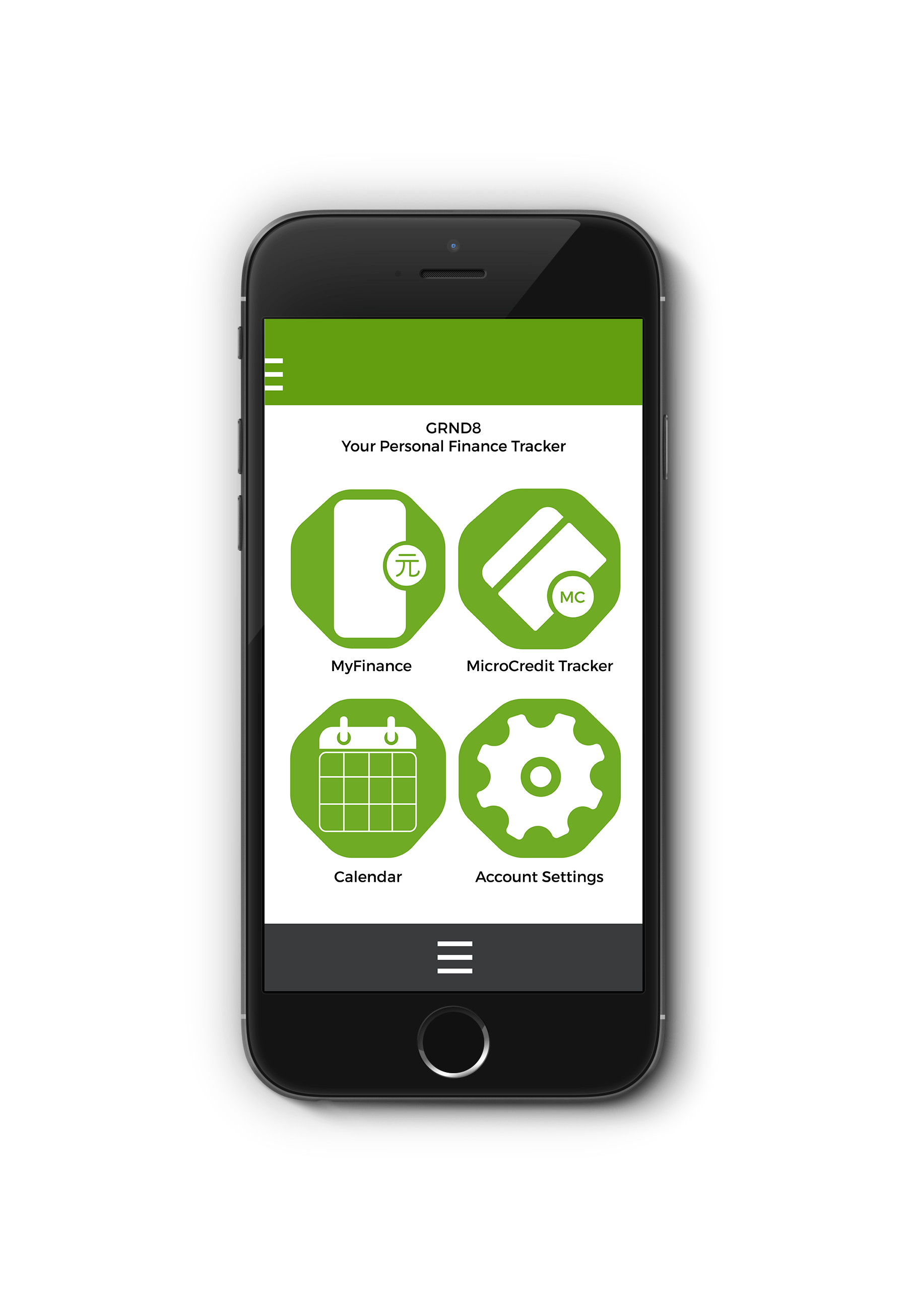
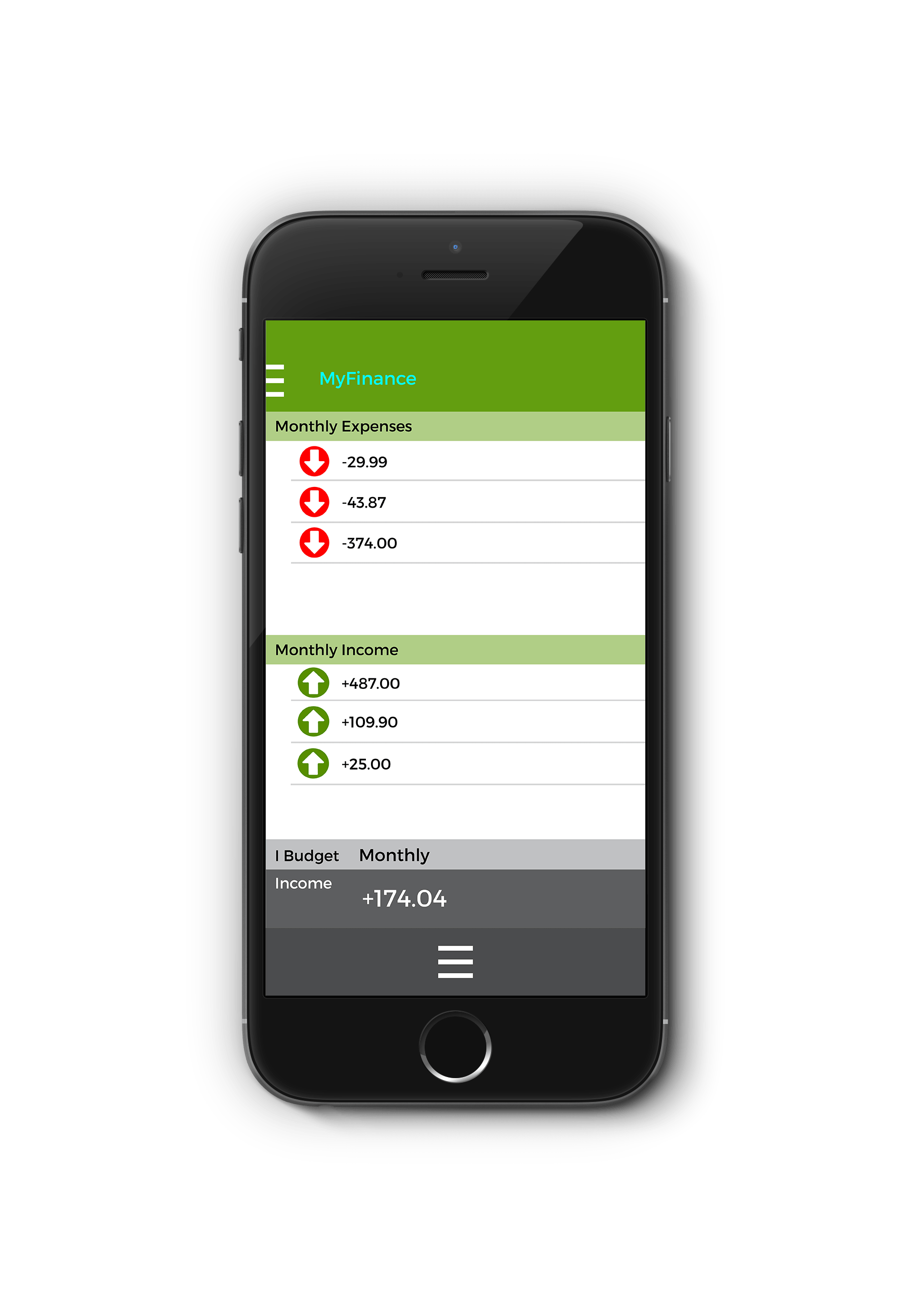
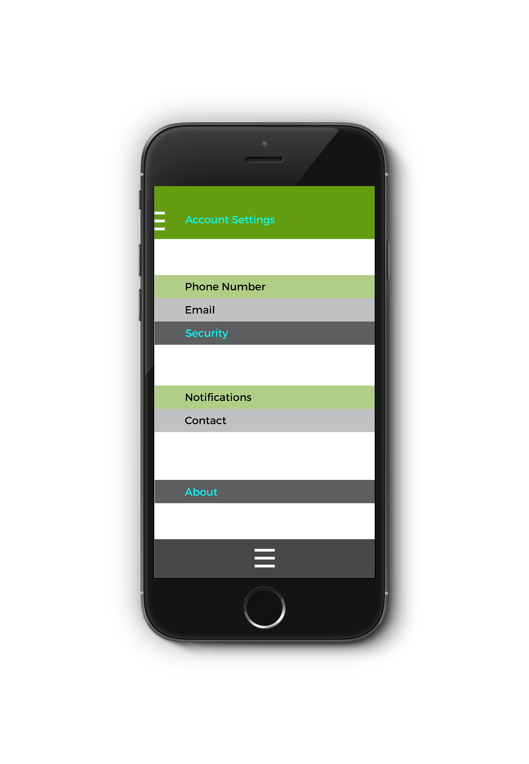
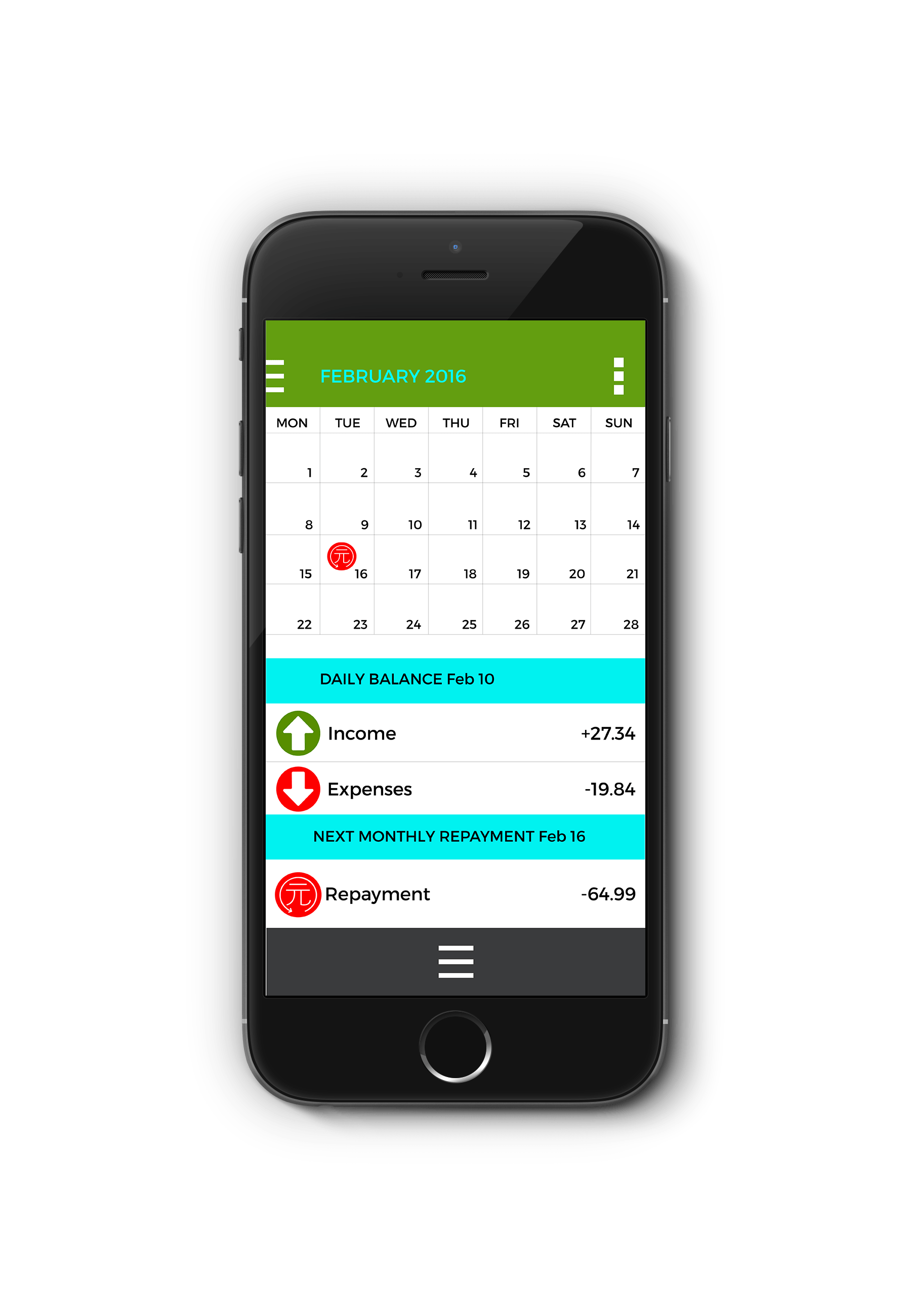
The designs for the iPhone and iPad applications were quite simplistic and lacked any clarity towards a feasible design. However, the user experience is well navigated through the use of identifiable iconography. The Iconography behind this project was effective in its direction. More attention could have been paid to the colour scheme and use of layout. Especially in the ‘Micro-credit Tracker’ screen that lacks any formulaic layout. Designing for iPhone required careful research into existing user journeys. My first initial designs were rejected because the typeface was too small and disjointed on the page. The designs excel in user navigation but simply needed more detail and refined designs to look aesthetically pleasing to consumers.
The iPad designs were simpler to produce after having base template from the iPhone designs. I may have chosen to use a slightly more varied colour palette. I like the main green because of its connotations towards money and wealth. I would use more relatable colours to compliment this main colour to develop this designs.
Overall, I feel this project has successfully tackled not only reaching my target audience but also solving a problem that arose through my research. The problem being that China needs more accessible microfinance. The products on offer are carefully designed to solve the problem of accessibility. With Du Xiaoshan’s statement on accessibility through mobile banking and computerised MIS systems, I have seeked to solve the problem through creating this system. The designs themselves need further developing as they are quite basic however the strength of this idea comes from the concept and website production that advertises the product.
Link to Realisation: http://grnd8finance.businesscatalyst.com/index.html