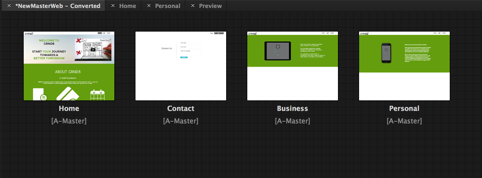
Due to the simplicity and lack of communication in the original designs for my website I have decided to complete rebrand the website and use a more flat design-oriented approach. The strong use of colour and communication will not only make the website look more appealing but also aid in the navigation of the user experience.
Muse Interface
Currently the navigation of the website is the same with a homepage and contact page. Then this is further split down into business and personal pages depending on the desired path of the user. I may choose to create a small video advertising the products that GRND8 has to offer.
The biggest difficulty with Adobe Muse at this point is that it is still relatively new. In order to correctly place images/grids in a certain way you need to offset this in the design window. Therefore you almost have to second guess where the images should be. The Adobe forums offer little help to decipher this problem where other people have had the same problem. Fortunately, I am able to publish my website using business catalyst so I have a suitable format to submit my work on the PDF.
Reverting the Logo
I have decided to revert back to the logo of ‘GRND’ with a Montserrat typeface with an ‘8’ that represents an infinity:
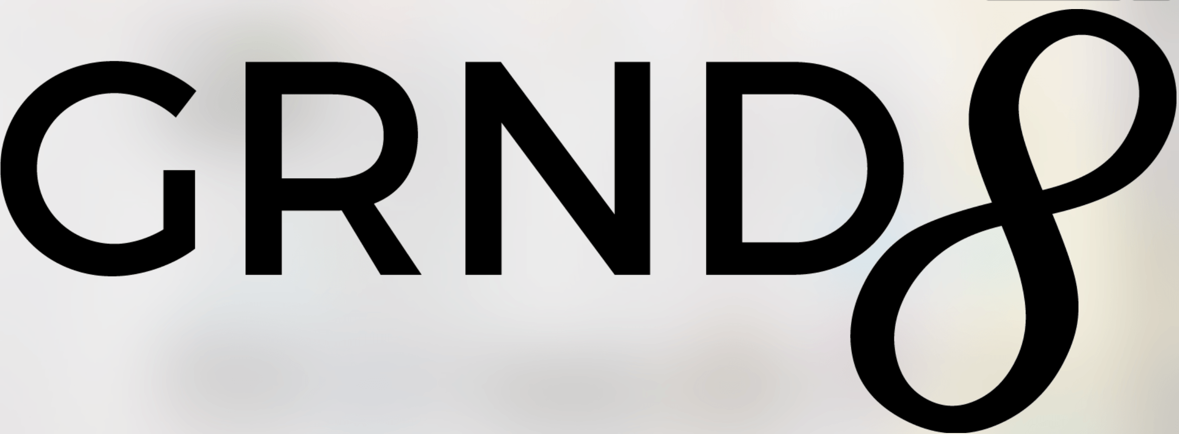
Finalised Logo
The logo is a lot more fluid and simplistic and can be used in a variety of situations like the iPhone and iPad designs.