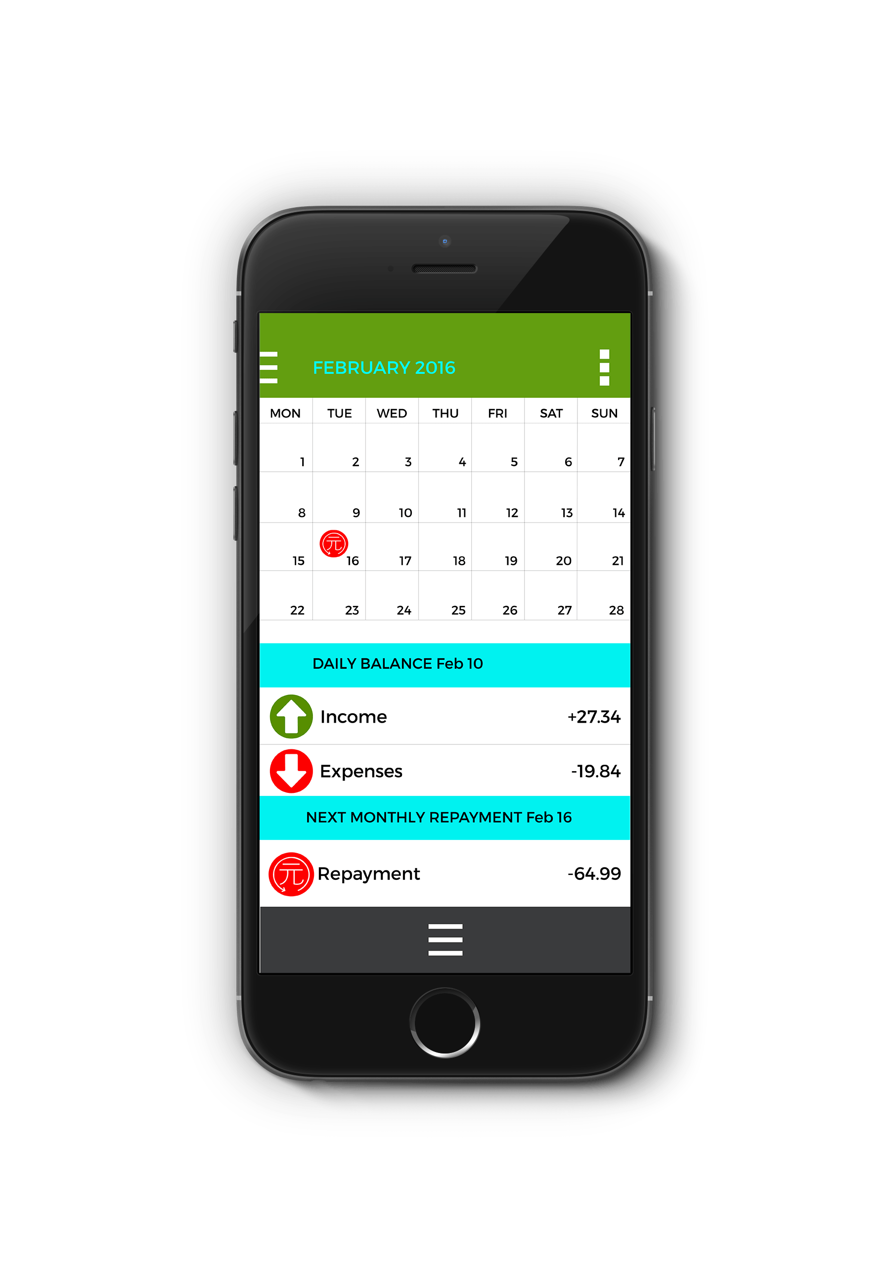
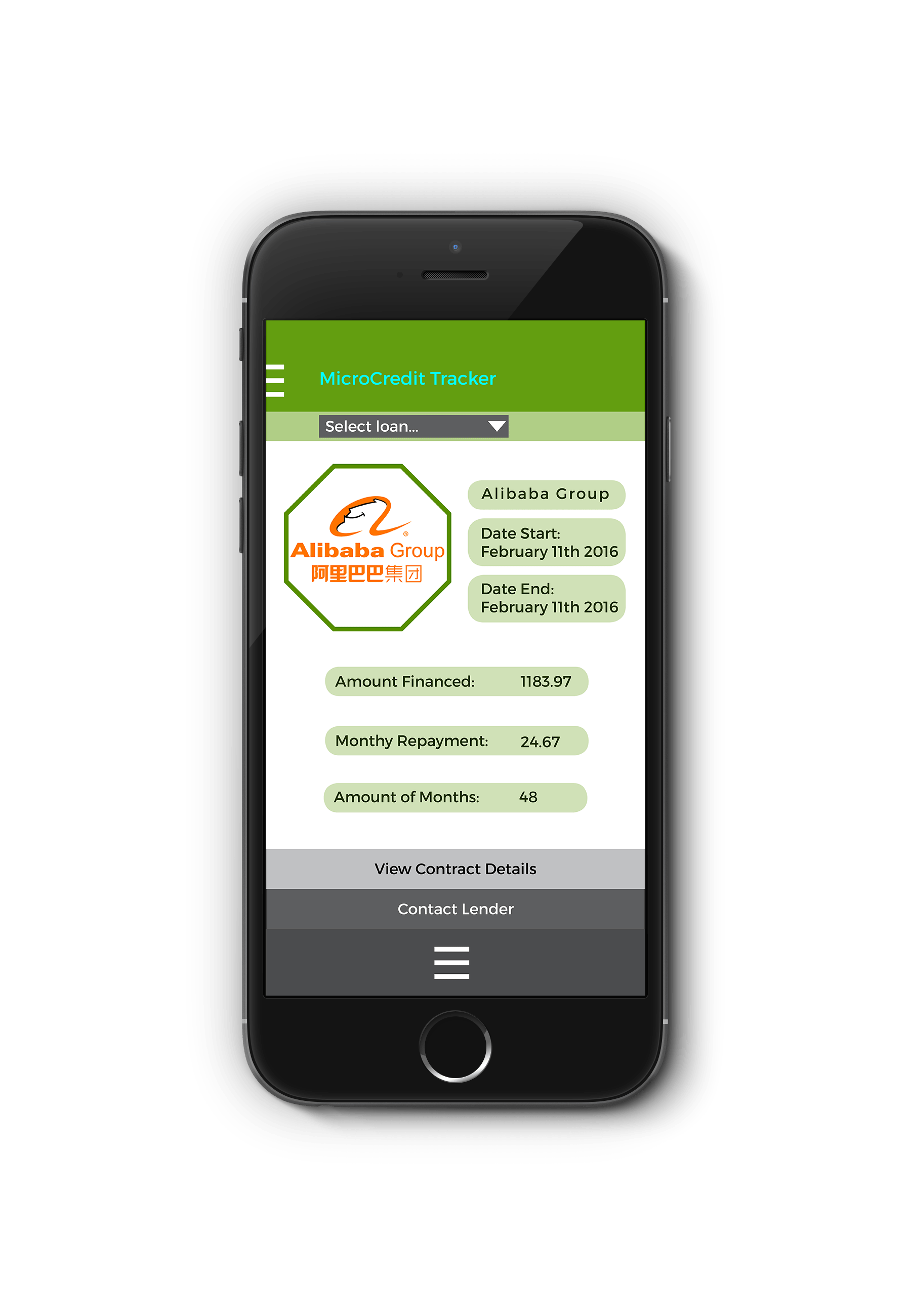
Using Mockups
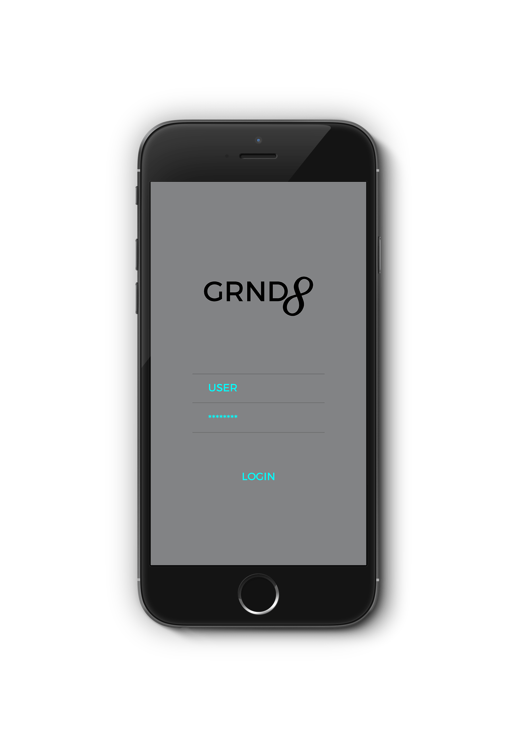
Since the first designs of my iPhone application, the overall design has taken different turns. The biggest issue was dealing with navigation and since then the navigation has greatly improved. The application can be operated by dragging screens upwards to bring up menus and going to the side to, for example, change the month on the calendar.
Iconography
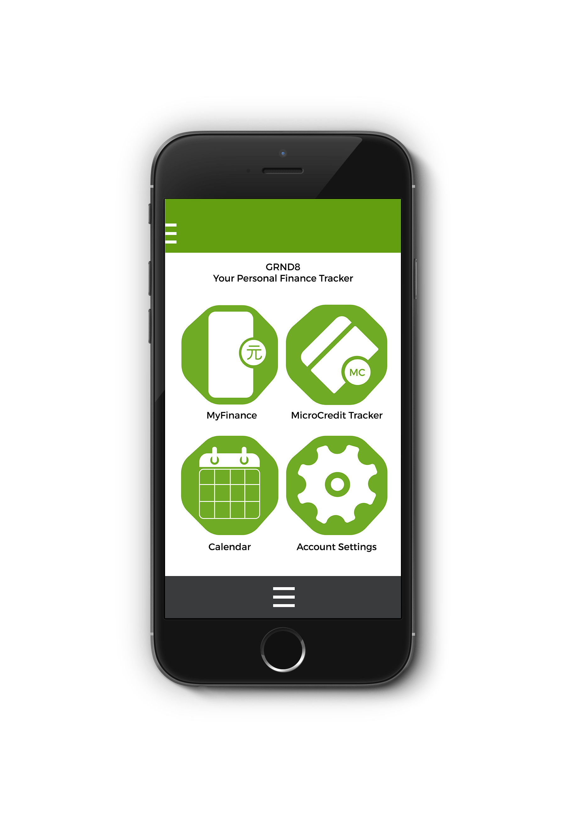
The Iconography was continuously developed in order for consumers to be able to identify with the symbolism. I had to work out which iconography worked best and in what ways to show this.
Colour Scheme
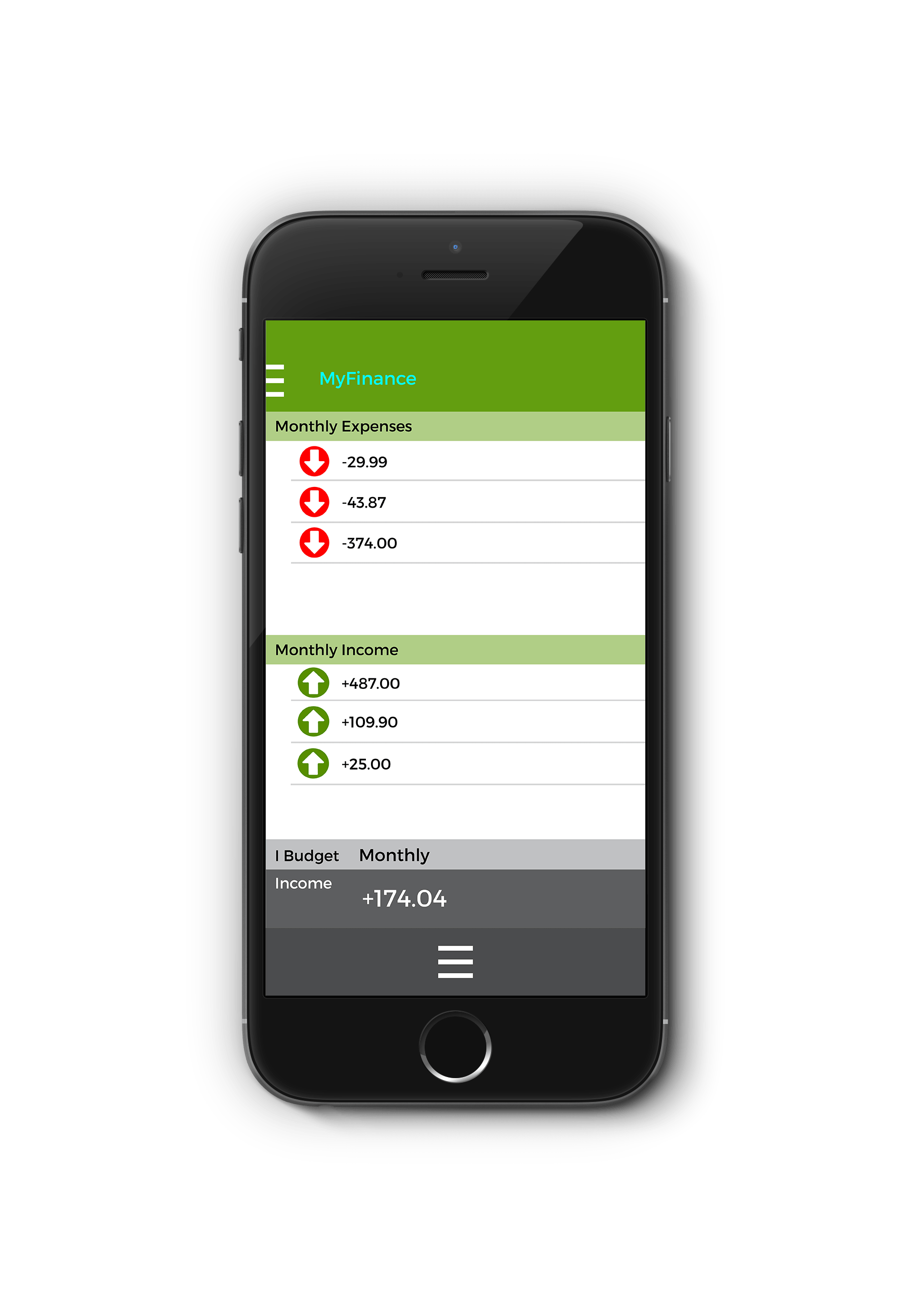
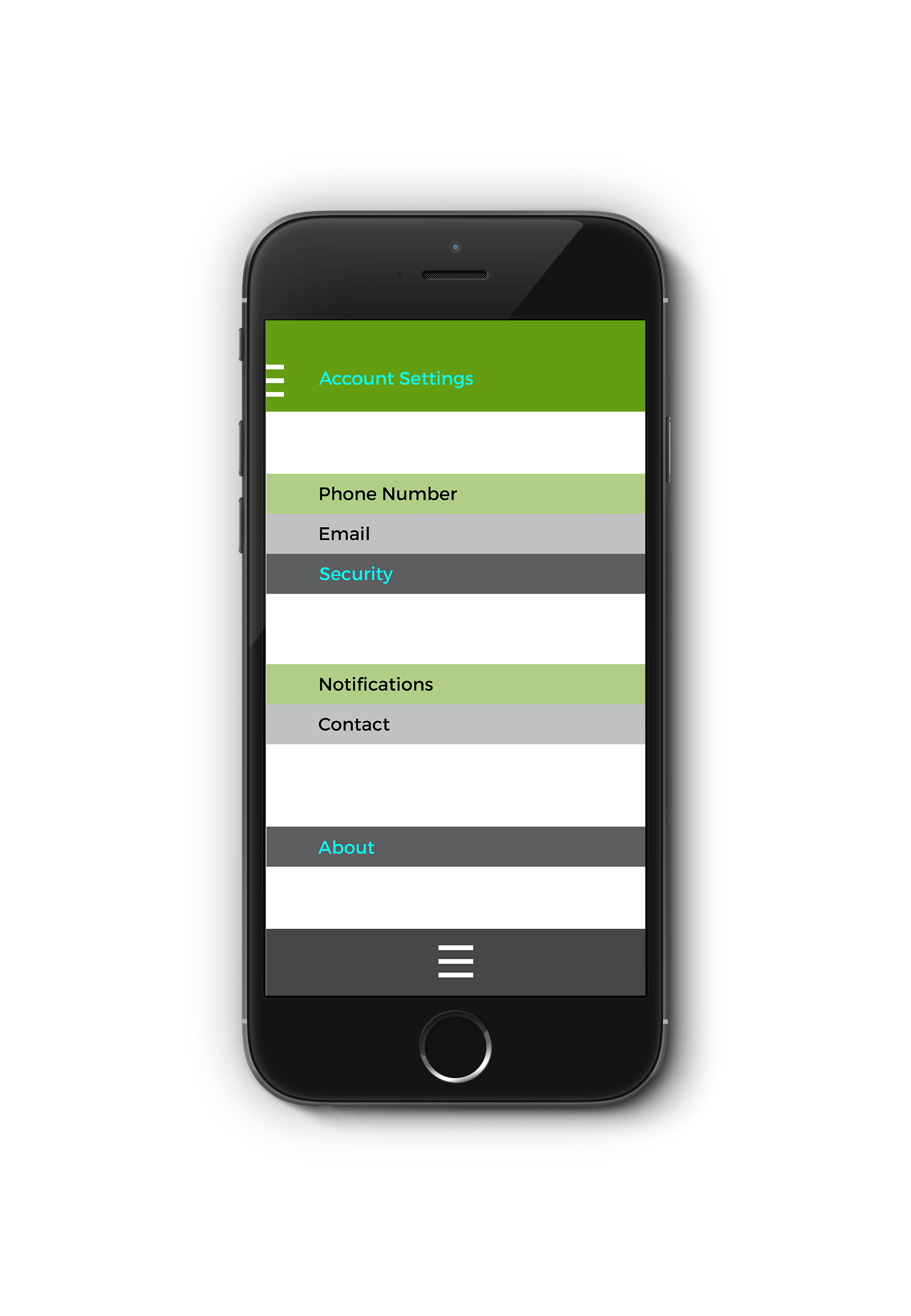
The colour scheme changed very little as I stuck with colours that represented stability and financial prospects. There was slight variation to compliment the colours more but they are effective in portraying a message.