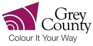
Why is this logo design bad?
The icon of Grey County has little relevance to what the company is trying to promote. There is an imbalance of serif and sans serif that creates an unnecessary contrast. The use of the slogan ‘colour it your way’ balanced with Grey County implies that there is nothing to colour or rather ‘bring to life’. However, this is all a matter of perception. Developing the logo itself to have more relevance could improve the design as well as using just one style of typeface.
Why is this logo design good?
The circular form presents of the logo presents a naturalistic flow. The accompanying image to the name of the company is relevant as the four-coloured objects look like tails and the bright colours emphasise the spark behind the company. The choice of colour palette is contrasting in a positive way mores than the imbalance of communication presented in Grey County. The typeface is maintained throughout implying formality and neatness.

