Initial Ideas :-
To kickstart the development of my iOS application I created a mind map to show the development of my ideas:
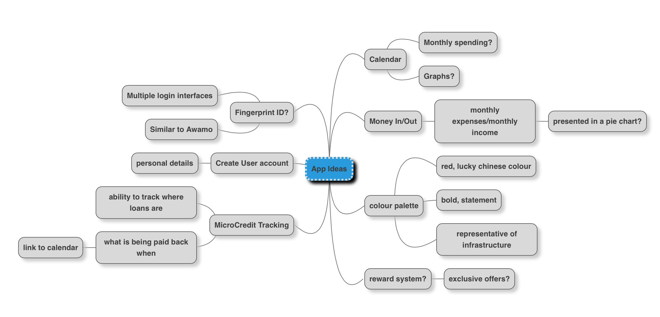
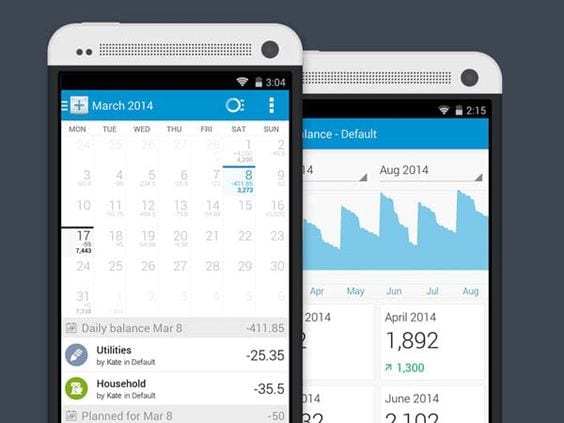
These elements that I was considering were produced after conducting research into existing UI Finance App design by SmashFreakz. The collection of images I was most interested in were collected on a Pinterest Board (https://uk.pinterest.com/karlsandford/app-inspiration/). In particular I was most interested in the ones that featured calendars. For example:
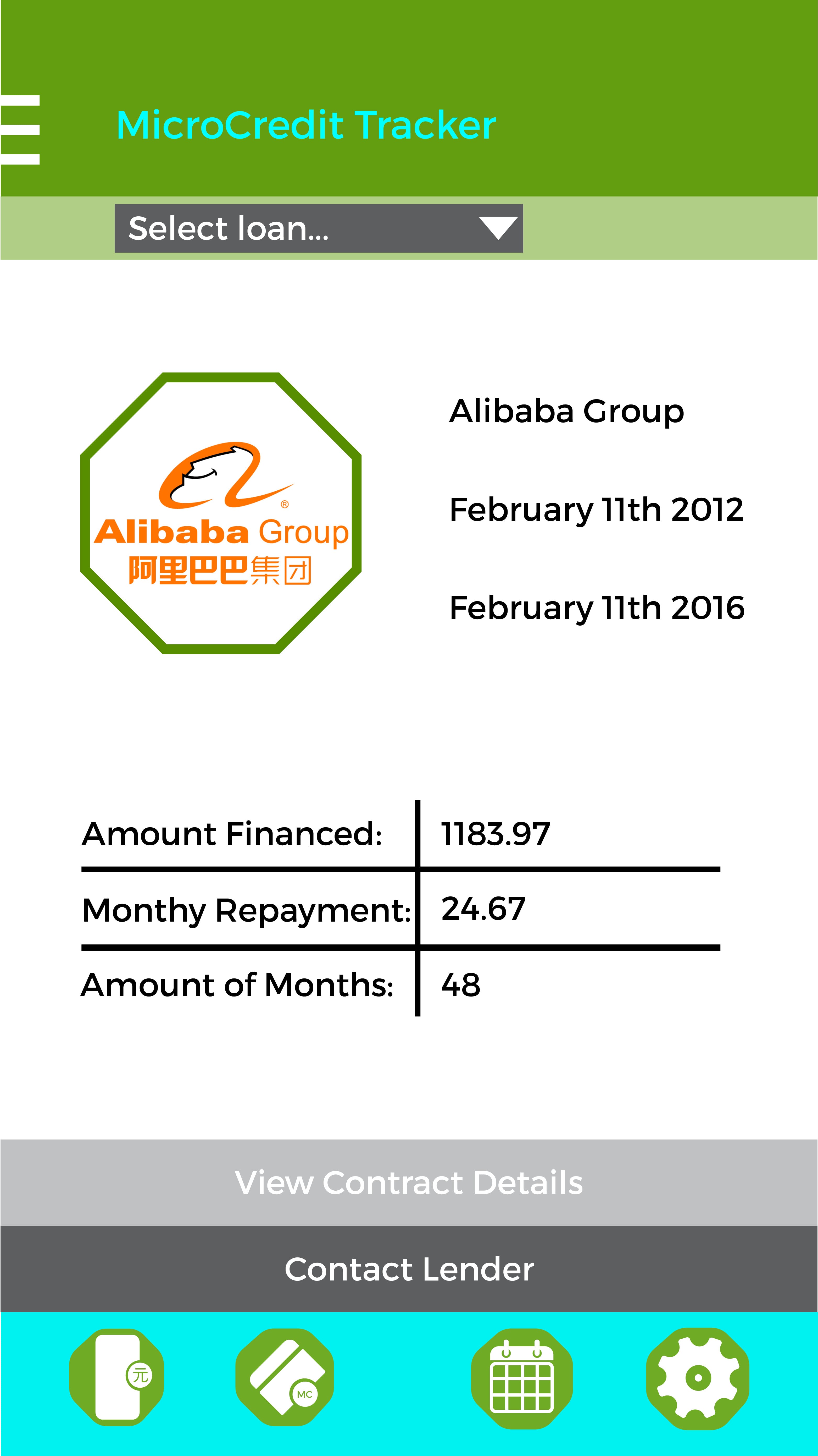
The use of a calendar can enable for financial tracking as well as microcredit tracking. Using the calendar, the date at which loans are repaid can be put onto the calendar so that those living in rural areas with little income are aware of the date this happens. This makes for no late repayments and therefore no extra chargers that could incur.
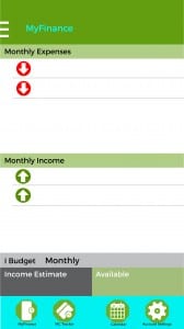
Another key area of development is the implementation of graphs and charts for financial tracking of income/expenses. The application would be directly with Chinese bank services to work as an all-in-one package for Mobile Banking as well as Financial Tracking.
Furthermore, the application will transcend beyond the pure inputting of information into a system, but it will also be user-orientated with the creation of a user account. So the user has the ability to login anywhere and everywhere to meet the needs of travelling.
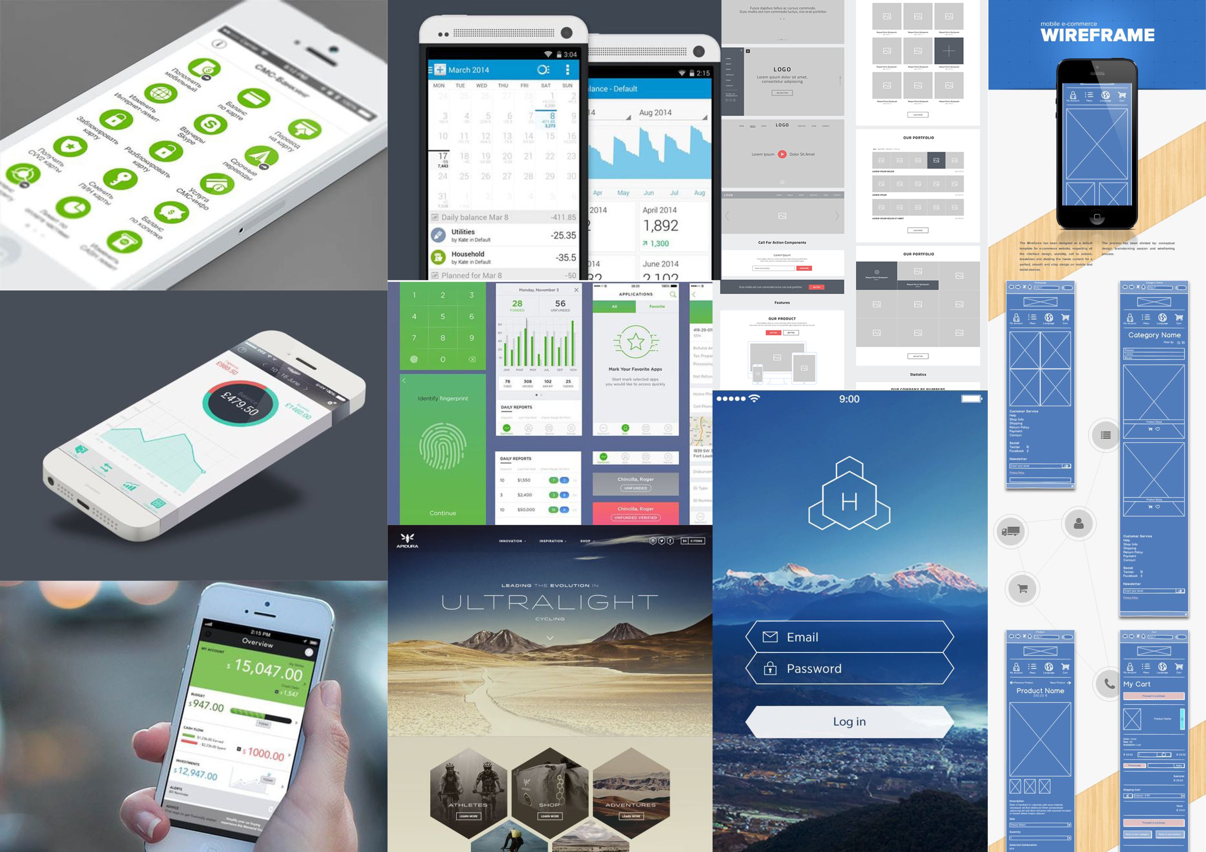
Moodboard of App Designs
In a Moodboard of App Designs I gathered from Pinterest I noticed a pattern in some of the designs. The financial applications featured a strong green-oriented colour palette. According to colour psychology, ‘Green is the color of prosperity and abundance, of finance and material wealth. It relates to the business world, to real estate and property. Prosperity gives a feeling of safety to green.’ (http://www.empower-yourself-with-color-psychology.com/color-green.html)
Furthermore, two of the designs feature hexagonal buttons for navigation. I may choose to incorporate octagons to suit the brand identity of GRND8.
Smartphone Users Demographics
Statistic provides a bar chart that shows the distribution of smartphone users to urban and rural areas in 2012. ‘In 2012, around 30 percent of Chinese smartphone users lived in rural areas.’
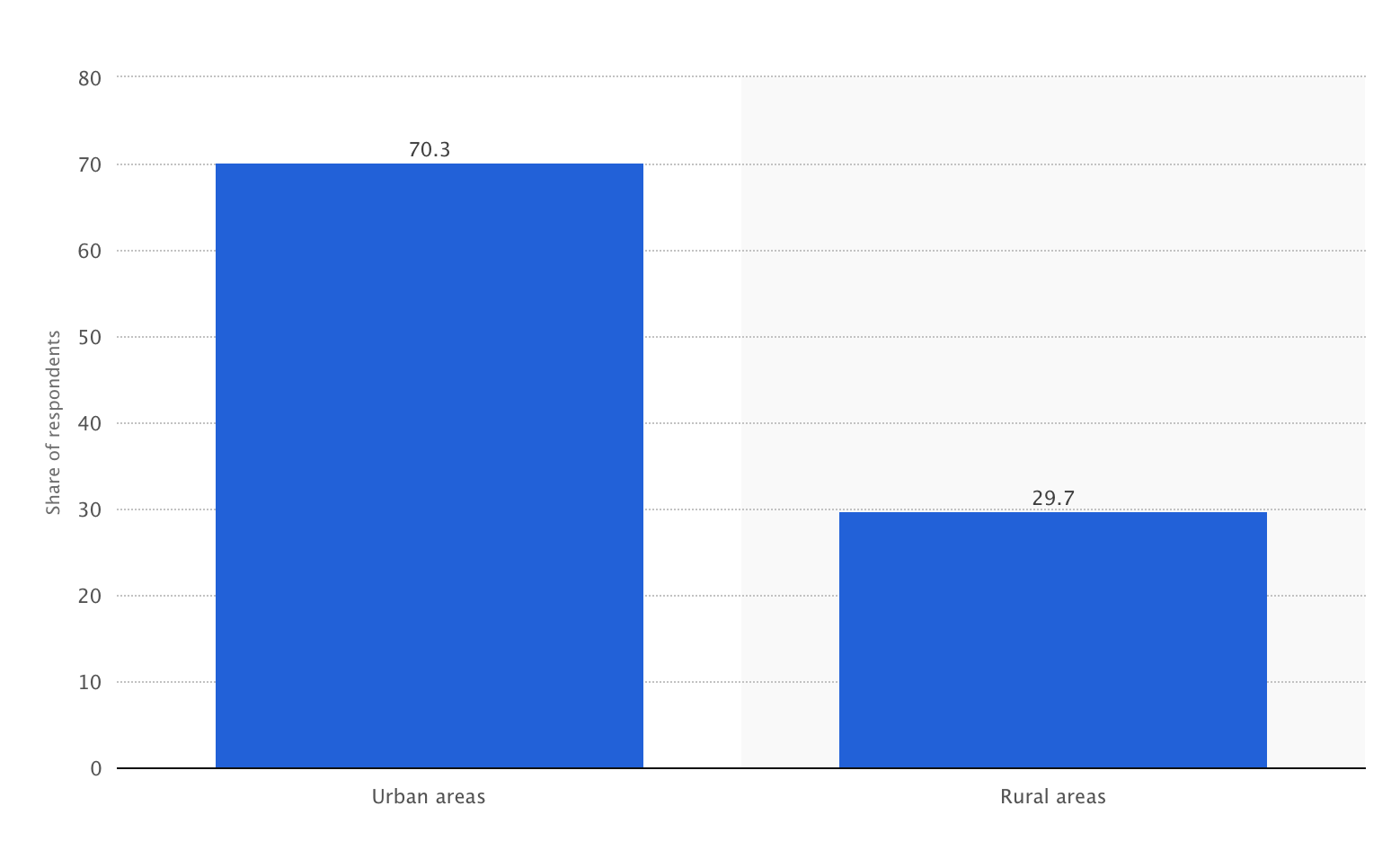
To further develop this I will create an application to be used on tablets that NGO MFIs can use with the customers. The reason behind this would be the development of POS services within China similar to Awamo in Africa. This would rely on the increase in technological awareness.
Beginning the Design:
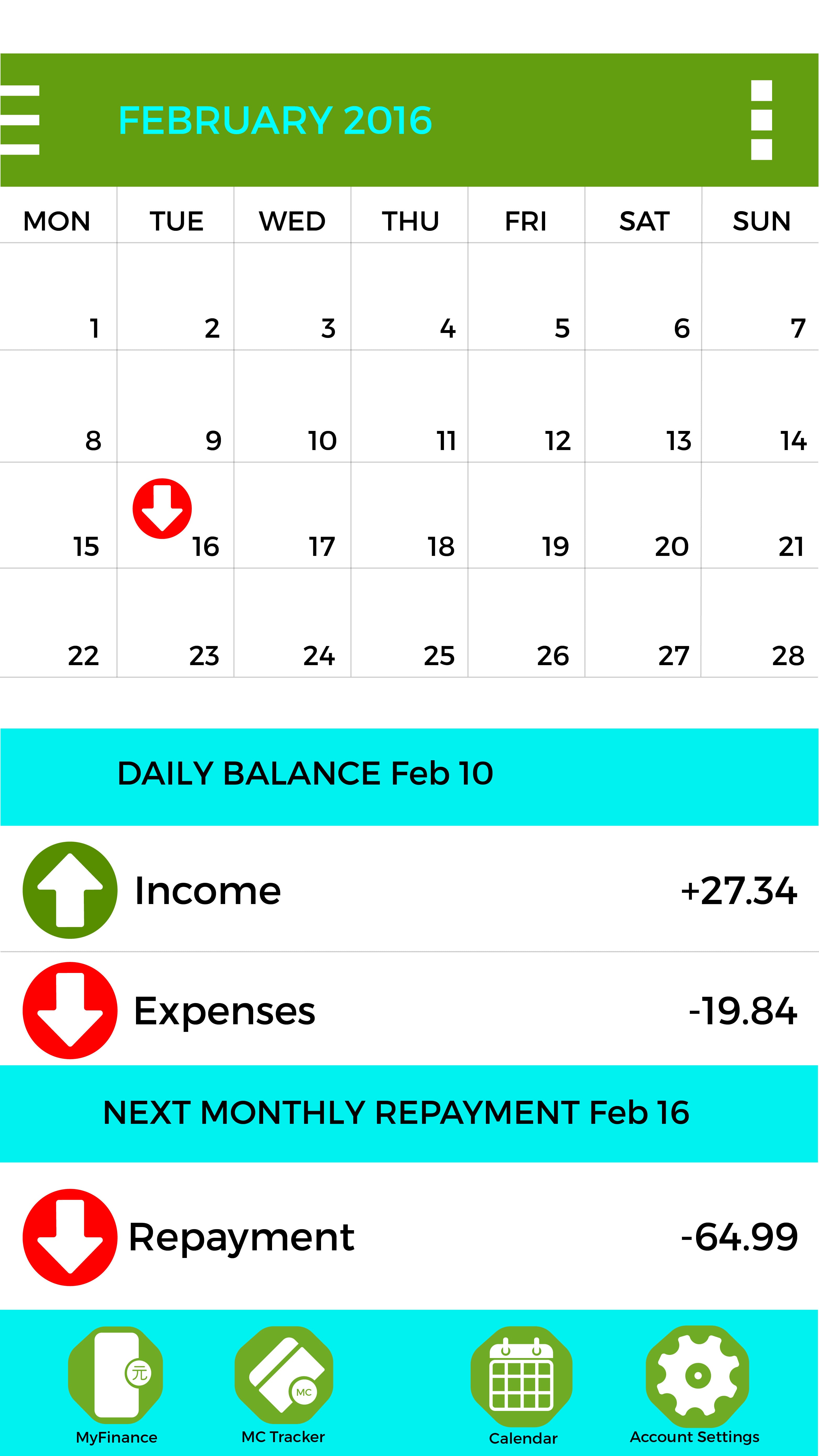
The first page design I created was for the calendar interface that would show daily income/expenses as well as month repayment tracking. Looking at this design it has ease of navigation but lacks detail. For example there is a lack of iconography that could lead to better user experience. The monthly repayment section needs a specific icon that can be placed on the calendar so that the user knows exactly when their month repayment is due.
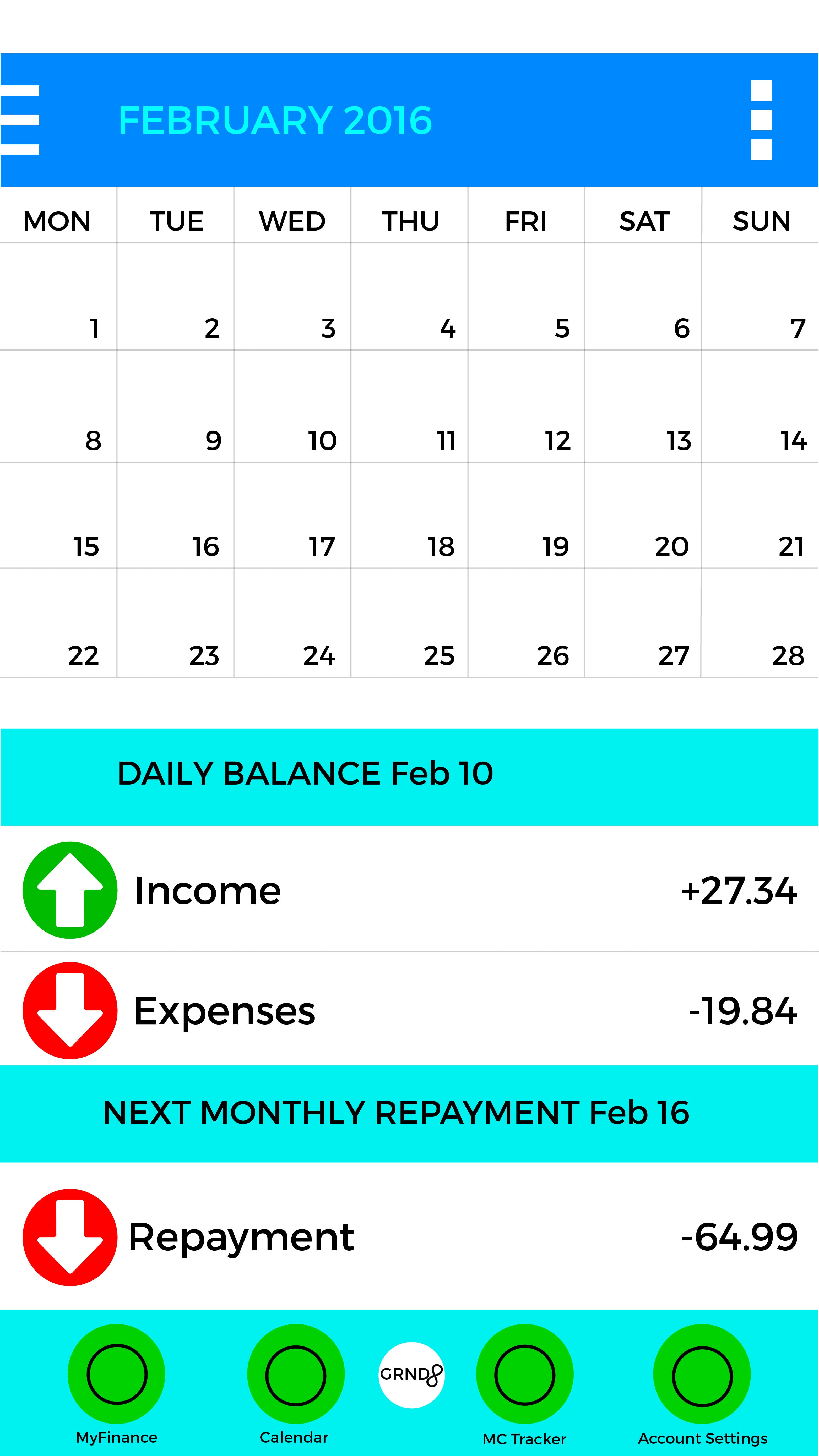
First Design: Calendar
At this point the colours are mere placeholders and such research needs to be adapted in order to adjust to colour psychology. The one issue I am seeing already is how far I can blur the lines between being a product for the consumer or it being a product for businesses to enable the customer to use their businesses.
Alternatively, I may consider purely focusing on iPad application development so these can realistically be ideally produced at a low cost/large scale according to Xiaoshan. This would enable a fingerprint interface, similar to Awamo.
The main differences between an iPhone and iPad application design would be that the iPad would be used to create financial loans for customers and the iPhone application would be used so customers can track their finances.
Updated Designs
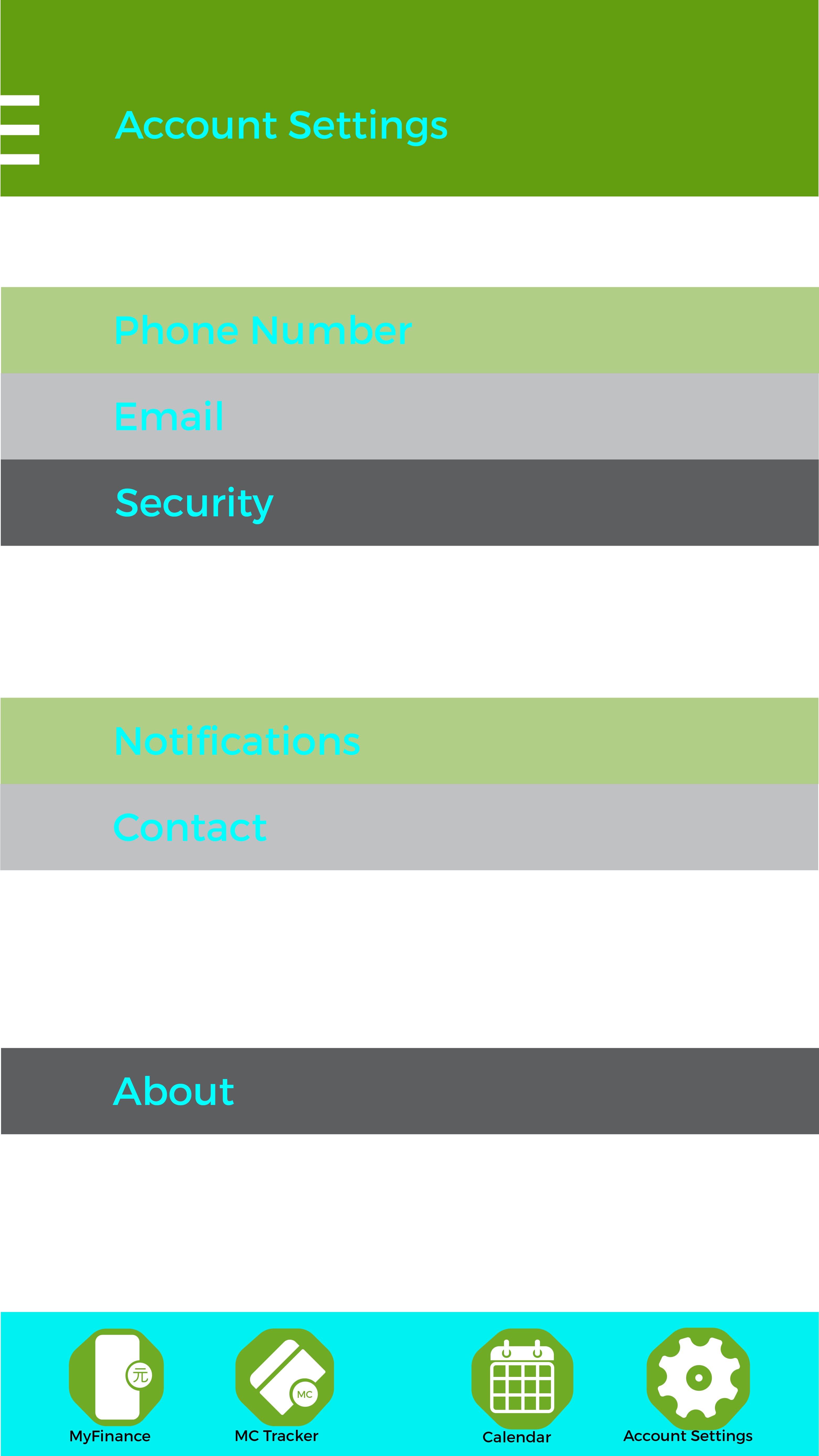
After I developed the first wave of designs for the interface I received some good criticism that gave me a large spectrum of ideas for development:
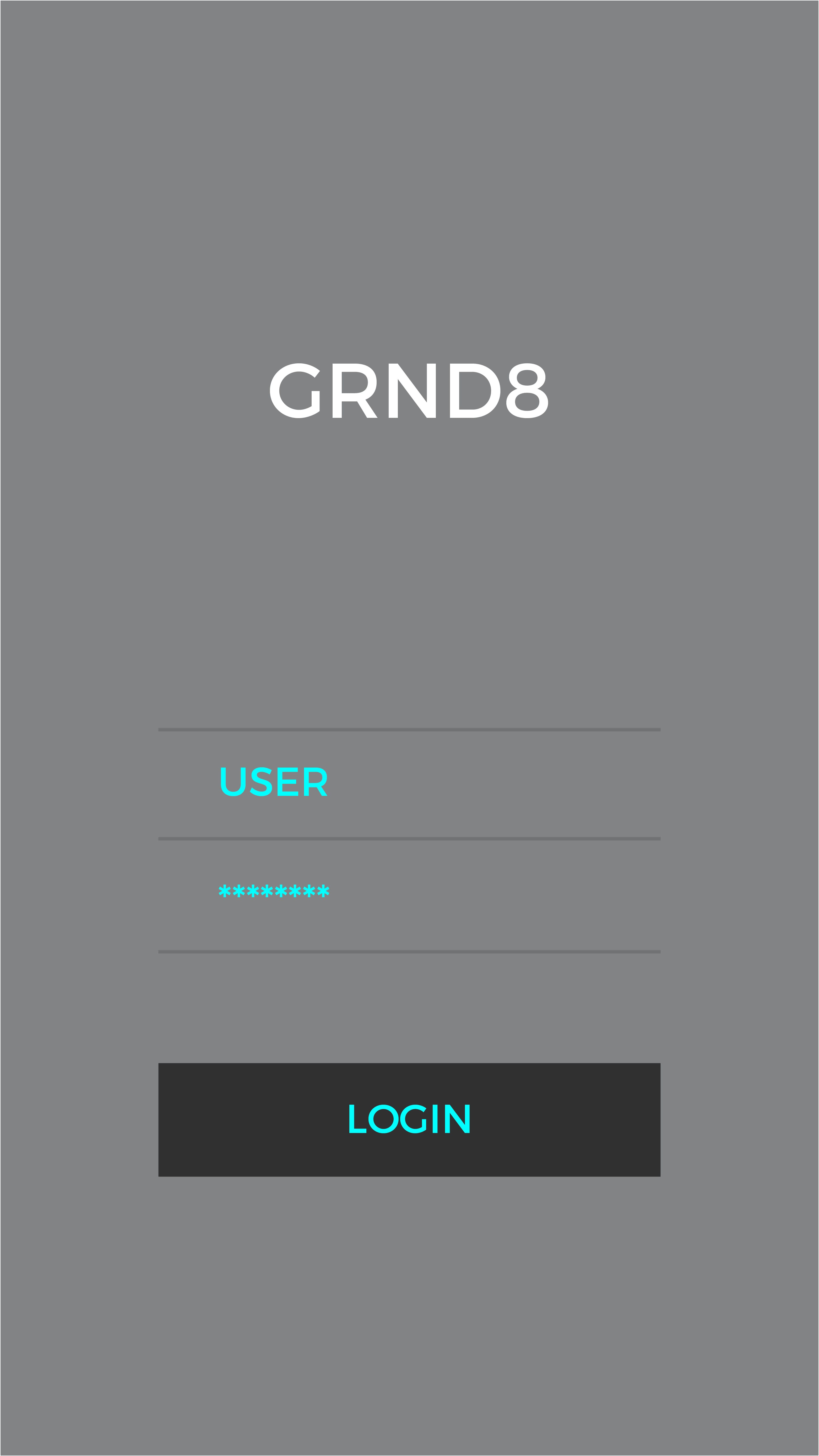
- Login screen is simple and effective. Can I get rid of the box around login?
- Iconography is needed for ‘monthly repayment.’
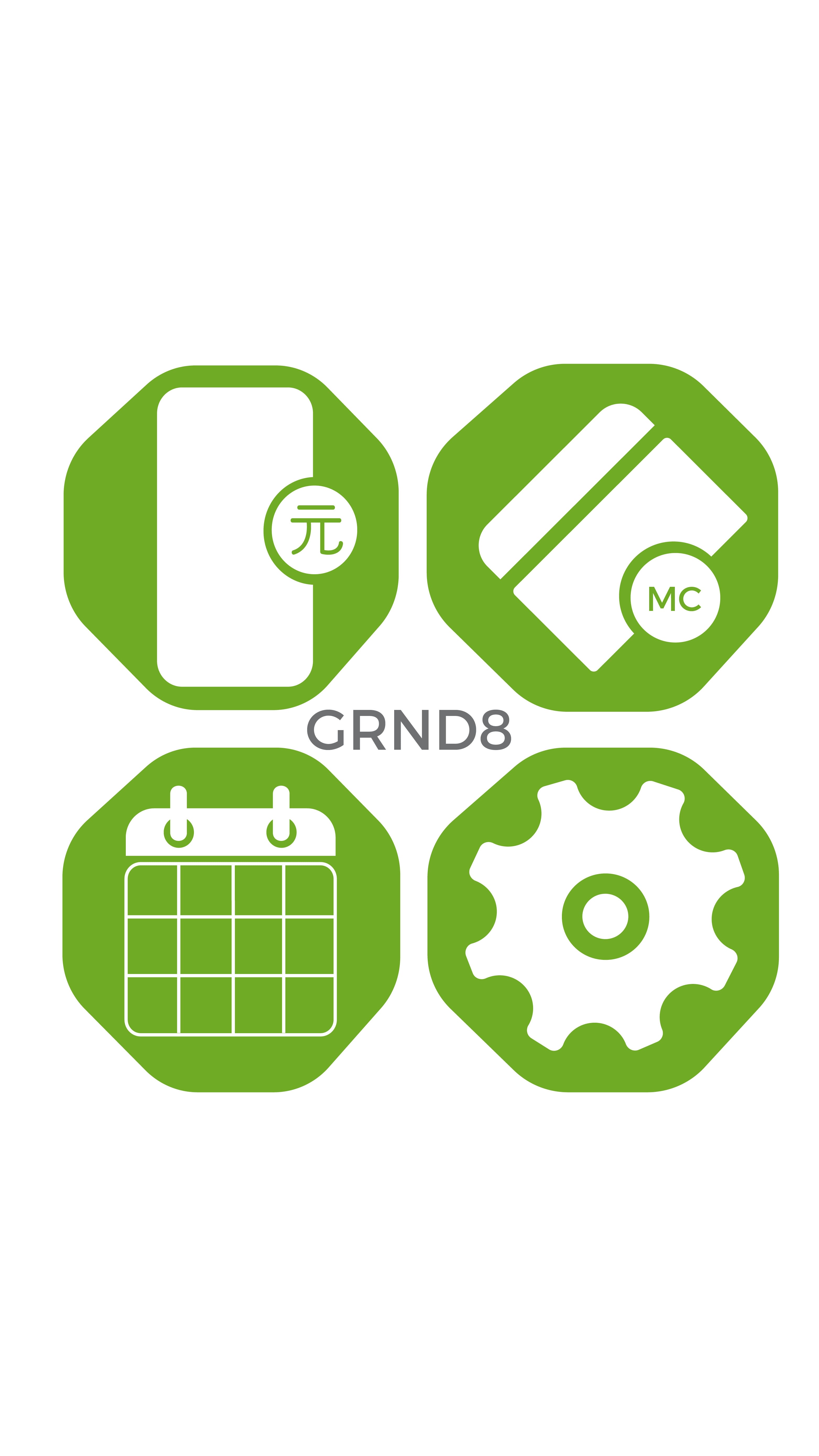
- Delete the text associated with the icons along the bottom of the screen. It is too small and unnecessary. Can I changed the interface to a swipe and drag motion. Changes the practicality. More free-flowing.
- Development of a menu screen.