Barclays Partner Finance
The Barclays Partner Finance homepage drew me to the development of a website that would function for both personal use and business use. Since the intended idea behind this project is to provide for both businesses and customers with an all-in-one package. I thought it would be suitable to develop a collection of operational webpages.
Barclays chose a particularly strong centre image with some key text on their homepage to target certain audiences. Barclays claims to aid business partners to ‘maximise their sales opportunities by helping their customers afford new purchases.’
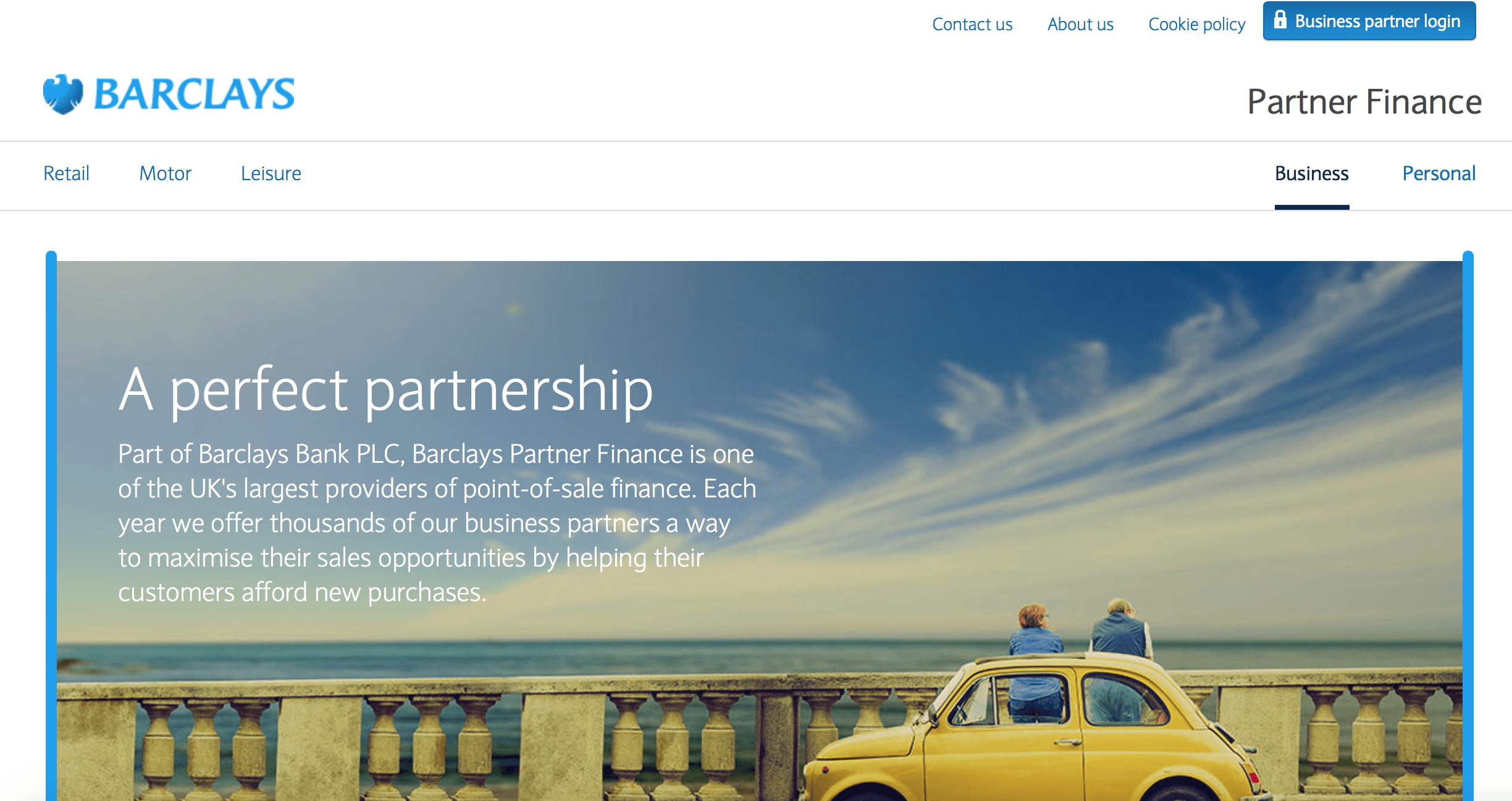
Barclays Partner Finance Homepage
Using wireframe.cc I started to map out a similar style for a webpage:-
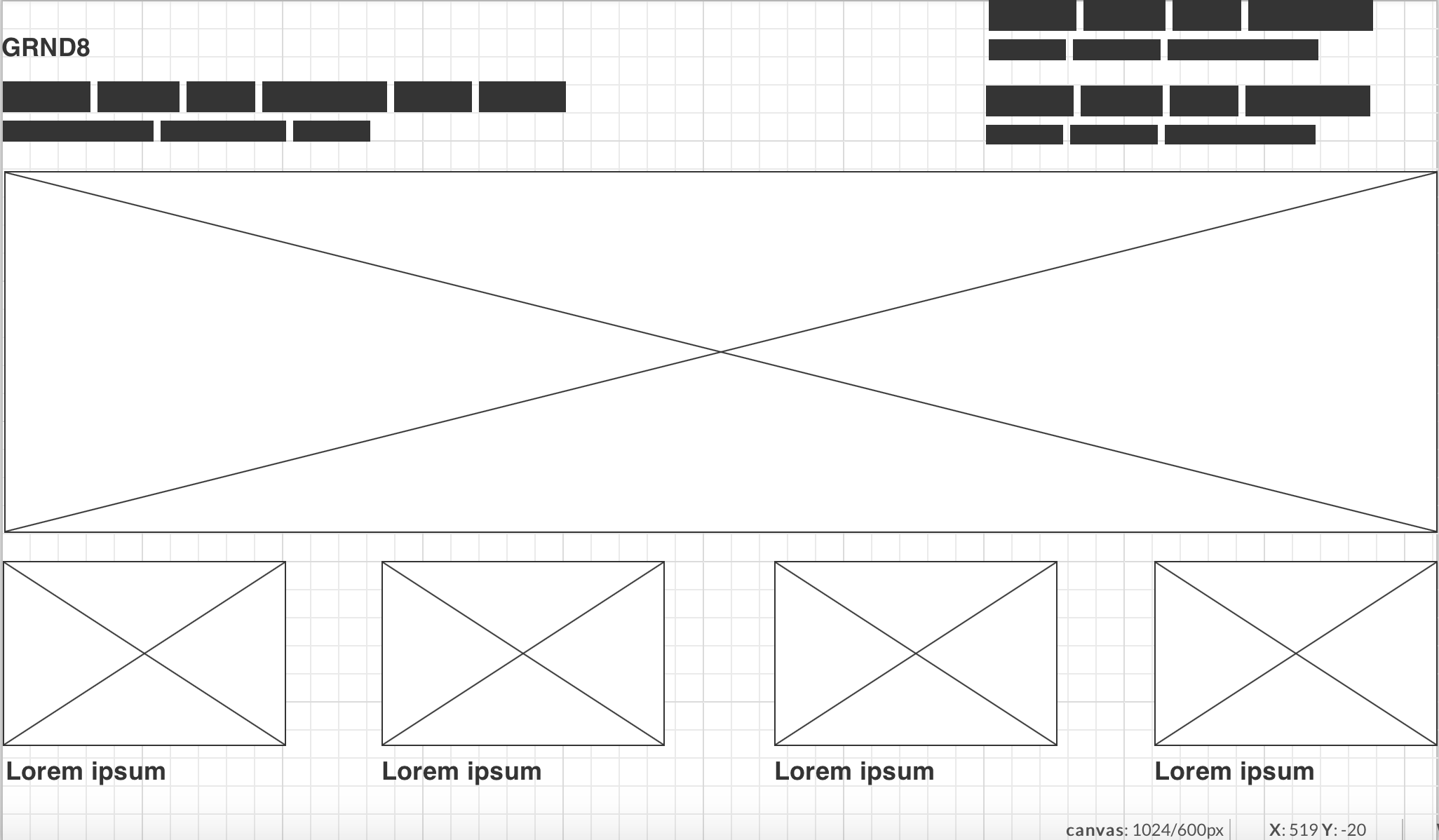
Early Website Design
To fully develop the interface of the website I went along the design of the Barclays website. The menu buttons will prominently feature login screens to track finances as well as work in harmony with the finance lenders that China has to offer.
The main image displayed along the top will primarily be aimed at the bustling farming industry of China, therefore an energetic image of workers and fields will be shown. The remaining icons along the bottom will focus on personal finances as well as implementing the calendar that displays dates at which information comes out.
Early Website Design
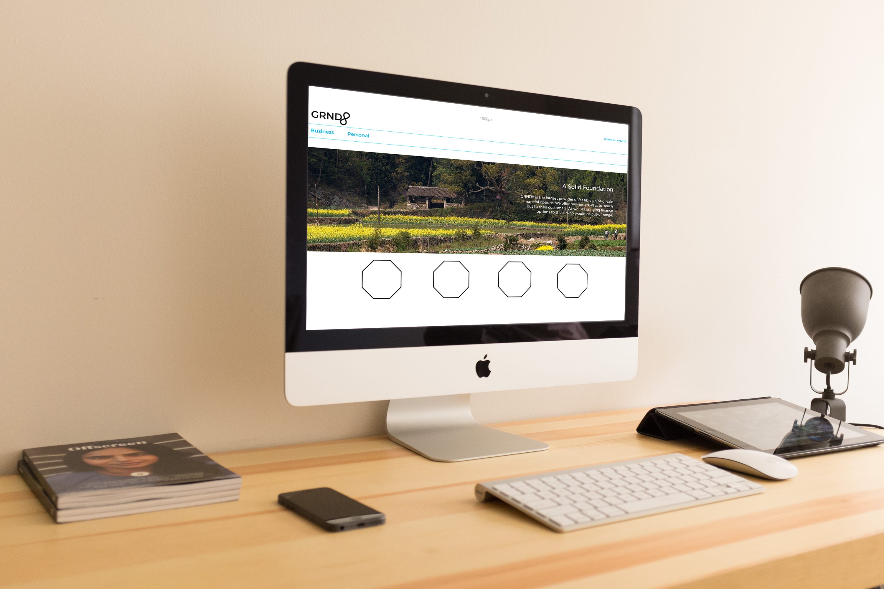
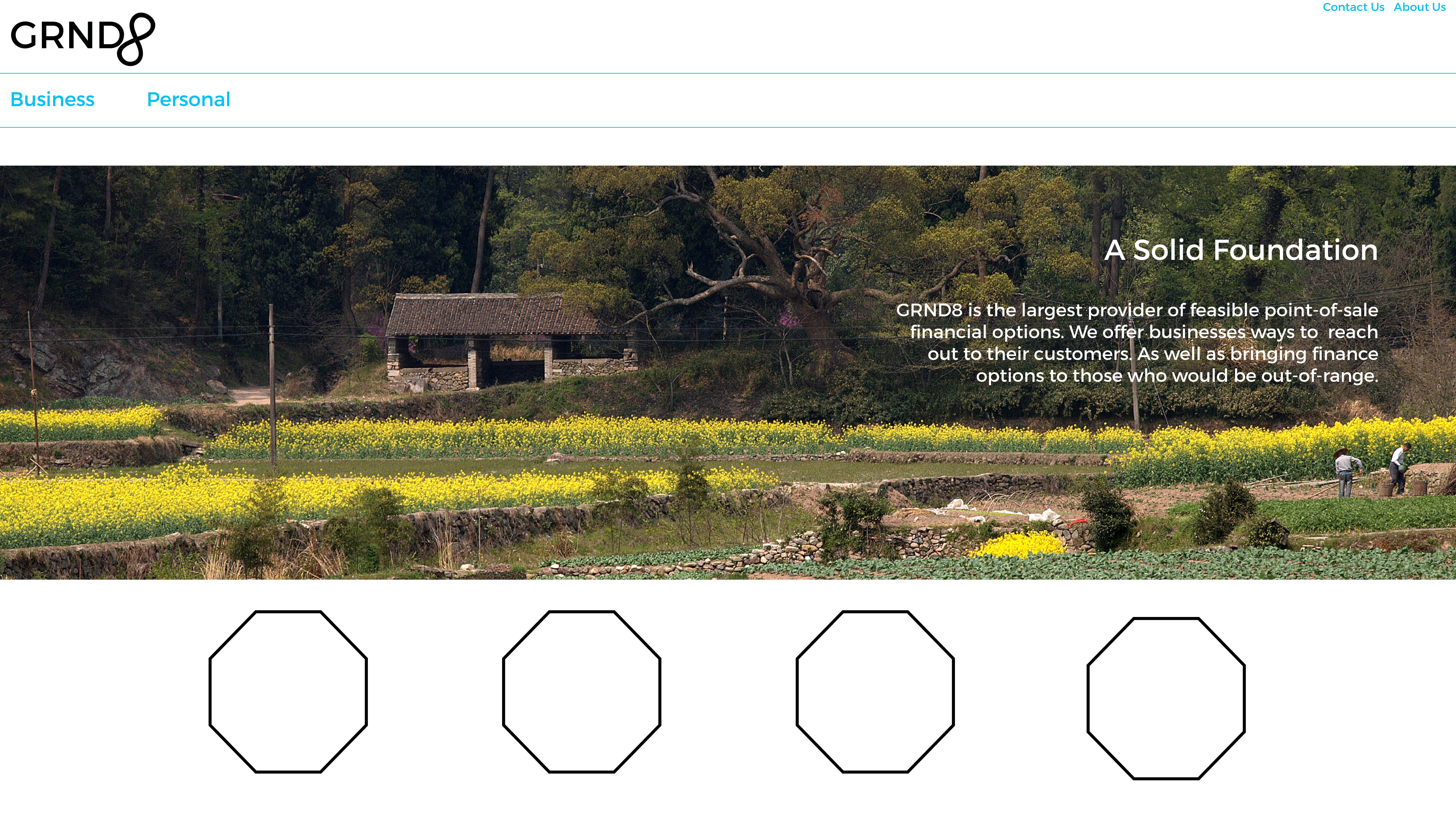
Test Mock-Up
To kickstart the development of my website I chose to implement that elements I had researched into. I took a royalty-free image of a Chinese farm and used it as the backdrop for development and growth. The current octagon’s are placeholders for images/icons that will be developed alongside the application design in an Iconography post. At this point I simply wanted to place the key elements in a layout for future reference. At the moment colour choice is influential to its own success. The subtle blue is similar to Barclays and may be changed to a light green in the near future.
Adobe Muse
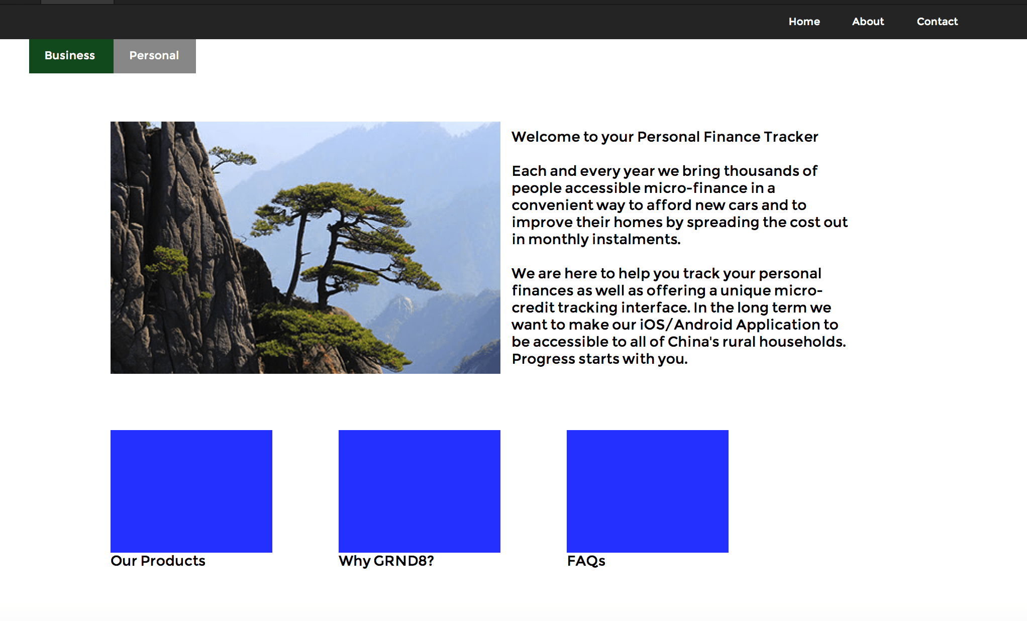
Using Adobe Muse and the basic wireframe I had created I developed a basic outline for my website with functioning web pages. Much like Barclays I have divided the navigation system into Business and Personal. This takes you to specialised pages that are accustomed to both the customers and businesses. The colour palette is typically finance based. I chose to use a set of colours that influenced the site [insert site here].
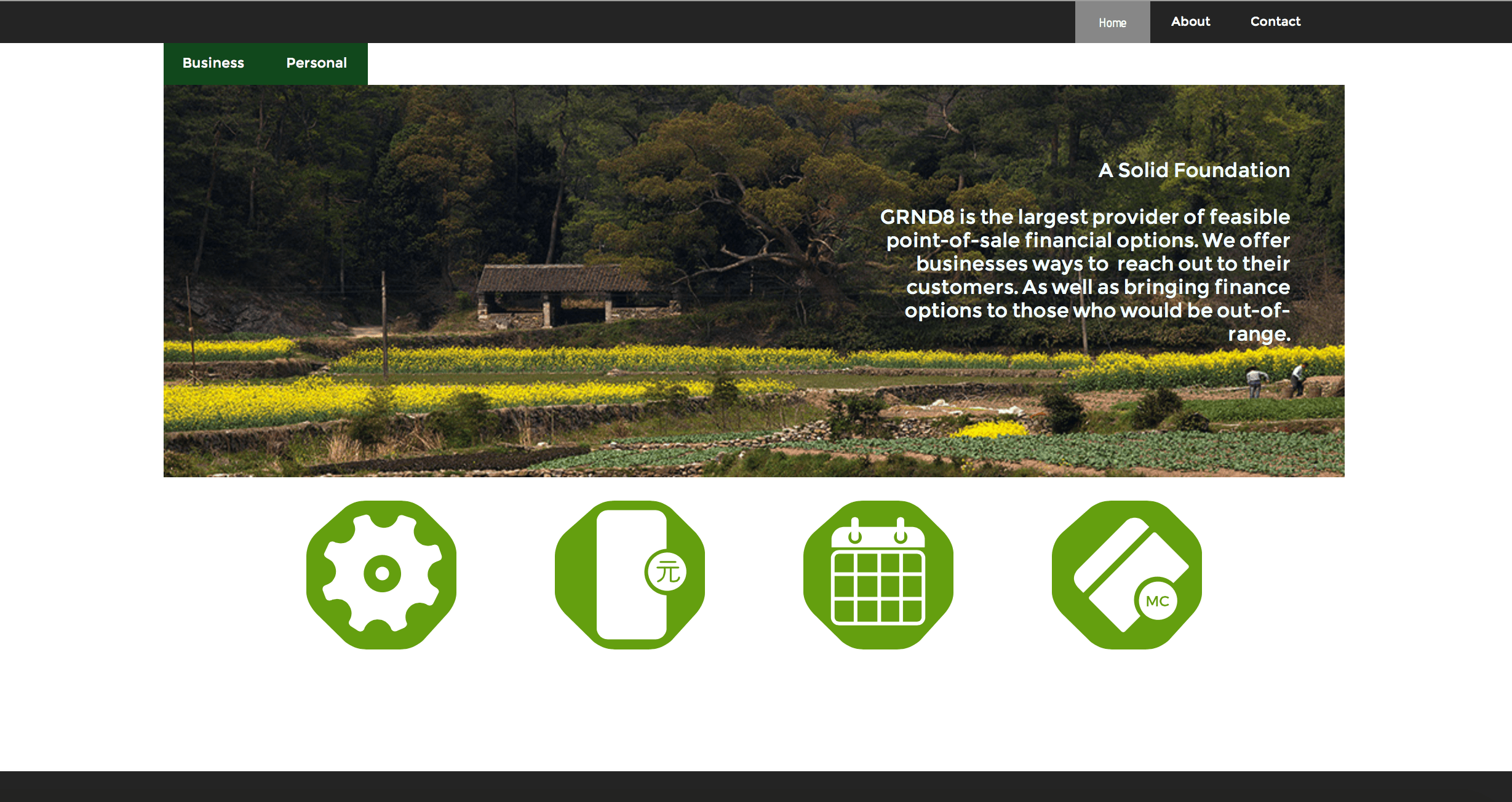
At this point in my design some of the images are placeholders for future development. I plan in changing the blue placeholder images to octagons.